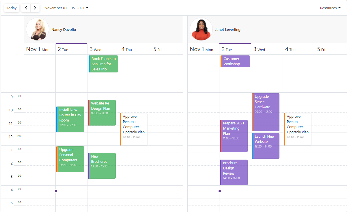
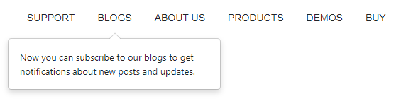
As you may already know, our most recent release (v21.2) includes a series of enhancements for the following DevExpress Blazor layout components: Blazor Menu, Blazor Context Menu, and Blazor Tab control.
Menu Data Binding
Our Blazor Menu control can be bound to both hierarchical or flat data. To incorporate the DevExpress Blazor Menu control in your next Blazor app, assign your data source to the component's Data property, add a DxMenuDataMapping item to the DataMappings collection, and map item properties (text, icon, and so on) to data source fields.
Additional settings are driven by data type.
Binding to Hierarchical Data
To bind the Menu component to hierarchical data and obtain the child item collection from the corresponding data source field, specify the DxMenuDataMapping.Children property.
You can define item hierarchy levels by using different item collections types. To specify different mappings for different hierarchy levels, add multiple DxMenuDataMapping items and specify the Level property for each instance.
<DxMenu Data="@Data"><DataMappings><DxMenuDataMapping Text="CategoryName" Children="Products"/><DxMenuDataMapping Level="1" Text="ProductName"/></DataMappings></DxMenu>

@code {
  public IEnumerable<ProductCategory> Data => new List<ProductCategory>() {
    new ProductCategory() { CategoryName = "Bikes", Products = {
        new Product { ProductName = "Mountain Bikes" },
        new Product { ProductName = "Road Bikes" }
      }
    },
    new ProductCategory() { CategoryName = "Clothing", Products = {
        new Product { ProductName = "Bib-Shorts" },
        new Product { ProductName = "Caps" },
        new Product { ProductName = "Gloves" }
      }
    } ,
  ...
  };
  public class ProductCategory {
    public string CategoryName { get; set; }
    public List<Product> Products { get; } = new List<Product>();
  }
  public class Product {
    public string ProductName { get; set; }
  }
}
Binding to Flat Data
To bind the Menu component to flat data (wherein parent-child relationships are defined by specific item properties), simply set the following property values:
<DxMenu Data="@Data"><DataMappings><DxMenuDataMapping Key="ID"
      ParentKey="CategoryID"
      Text="Name" /></DataMappings></DxMenu>

@code {
  public IEnumerable<ProductDataItem> Data => new List<ProductDataItem>() {
    new ProductDataItem() { ID = 0, Name = "Bikes" },
    new ProductDataItem() { ID = 1, Name = "Mountain Bikes", CategoryID = 0 },
    new ProductDataItem() { ID = 2, Name = "Road Bikes", CategoryID = 0 },
    new ProductDataItem() { ID = 3, Name = " Clothing" },
    new ProductDataItem() { ID = 4, Name = "Bib-Shorts", CategoryID = 3 },
    new ProductDataItem() { ID = 5, Name = "Caps", CategoryID = 3 },
    new ProductDataItem() { ID = 6, Name = "Gloves", CategoryID = 3 },
    ...
  };
Our Blazor Menu includes a single class ProductDataItem - whose objects encapsulate category and product data. Note that this class includes an additional property (Category ID - used to map products to a corresponding category):
  public class ProductDataItem {
    public object ID { get; set; }
    public object CategoryID { get; set; }
    public string Name { get; set; }
  }
}
Binding to Observable Collection
The DevExpress Blazor Menu component automatically re-renders items if its data source uses a collection that implements the INotifyCollectionChanged interface. For example, when you add/remove an item, or clear the child item collection, a data change notification is sent to the menu component by the INotifyCollectionChanged interface.
Demo | Documentation
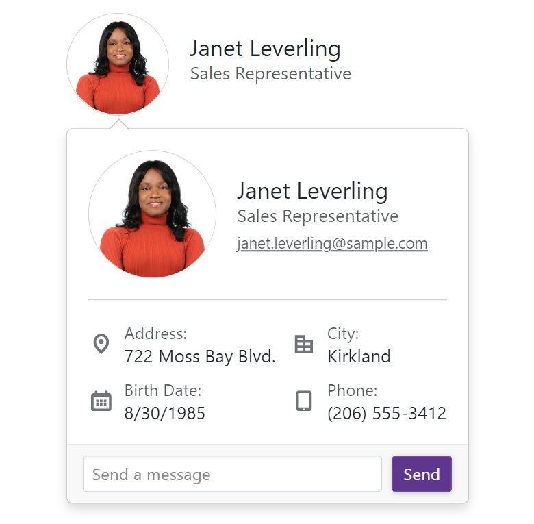
Context Menu Templates
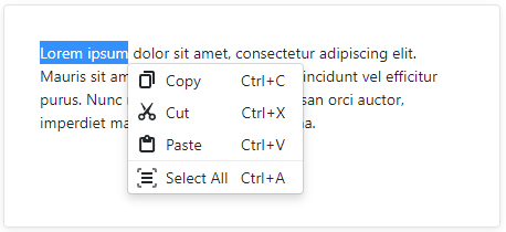
Our Blazor Context Menu allows you to modify the layout and appearance of its items and submenus. You can use the following new properties to specify both common and individual item templates:
The following code demonstrates how to create copy/cut/paste UI menu items using the templates:
<DxContextMenu @ref="@ContextMenu" Data=@commands ItemClick="@OnItemClick"><DataMappings><DxContextMenuDataMapping Text="Name" IconCssClass="IconCssClass" BeginGroup="BeginGroup" /></DataMappings><ItemTemplate><div class="d-flex px-2 py-1"><span class="mr-1 @context.IconCssClass"></span>
      @context.Text<span class="ml-auto">@(((MenuCommand)context.DataItem).Shortcut)</span></div></ItemTemplate></DxContextMenu>
The following code demonstrates how menu item data objects are created:
List<MenuCommand> commands = new List<MenuCommand> {
  new MenuCommand() { Name = "Copy", IconCssClass = "menu-icon-copy menu-icon", Shortcut = "Ctrl+C" },
  new MenuCommand() { Name = "Cut", IconCssClass = "menu-icon-cut menu-icon", Shortcut = "Ctrl+X" },
  new MenuCommand() { Name = "Paste", IconCssClass = "menu-icon-paste menu-icon", Shortcut = "Ctrl+V" },
  new MenuCommand() { Name = "Select All", IconCssClass = "menu-icon-selectall menu-icon", Shortcut = "Ctrl+A", BeginGroup = true }
};
![blazor-context-menu-templates]()
Demo | Documentation
Tabs Scroll modes
In previous versions, tabs were moved to a new line when they extend beyond a container's width. With our most recent release (v21.2), our Tabs component for Blazor allows you to specify whether to display overflowing tabs and how the user can navigate to them via the new DxTabs.ScrollMode property:
- Swipe - The container only displays tabs that fit the container's width. To navigate to other tabs, users can scroll the container via our scrolling mechanisms based on device type: hover the container, hold Shift and scroll the mouse wheel on desktop devices or swipe to the left or right within the container on mobile and tablet devices.
- NavButtons - The container only displays tabs that fit the container's width. Users can click the left or right navigation button to scroll the container and navigate to other tabs. Navigation via the scrolling mechanisms mentioned above is also supported.
- Auto - Scroll mode adapts to device type. Mobile and tablet devices use Swipe mode. Desktop devices use NavButtons mode.
- NoScroll - Users cannot scroll tabs. Tabs are moved to a new line when they extend beyond a container's width.
For example, the code below sets scroll mode to Auto :
<DxTabs ScrollMode='TabsScrollMode.Auto'>...</DxTabs>
In this instance, tab navigation buttons appear on desktop devices when space prohibits the display of all tabs:
![blazor-tabs-scroll]()
Swipe scrolling is also enabled for mobile and tablet devices:
![blazor-tabs-scroll-mobile]()
Demo | Documentation
![]()


