Quantcast
Channel: ASP.NET Team Blog
Viewing all 372 articles
Browse latest View live

ASP.NET MVC Query Builder - (coming soon in v18.1)

$
0
0

Use the powerful DevExpress Query Builder with your DevExpress ASP.NET MVC controls, starting with the v18.1 release!

The Query Builder component allows an end-user to visually build queries using our UI controls. This saves the end-user from learning and writing SQL statements. Once the queries are built, you can then apply those queries on existing DevExpress controls like the ASP.NET MVC GridView. This puts the power of ad-hoc querying in your end-users control.

Here's a screenshot of the MVC Query Builder control, click on the image for a larger version:

The Query Builder was first introduced as part of our XtraReports' Web Report Designer and then was released as a separate control for ASP.NET Web Forms. Many of you have requested this as an independent control for ASP.NET MVC and now it's available in v18.1 release.

Features

We've packed a ton of great features in the DevExpress ASP.NET MVC Query Builder:

  • The database schema is automatically obtained and displayed within the QueryBuilder's UI. You can also customize the database schema at runtime by implementing a custom schema provider to reduce the list of tables and views available for an end-user
  • Relationships between tables are automatically resolved based on foreign keys
  • An enhanced filter editor features the Advanced Mode allowing you to specify a filter string manually instead of using a visual editor. The code completion is available
  • Ability to visually shape retrieved data (sort, group and filter), which automatically edits 'ORDER BY', 'GROUP BY' and 'WHERE' query clauses
  • Ability to use the 'SELECT DISTINCT' clause
  • Aggregation of columns’ data
  • Preview entire SELECT statement
  • Preview the Query execution results

How do you plan to use the Query Builder in your ASP.NET MVC projects? Drop me a line below.

Thanks!


Email: mharry@devexpress.com

Twitter: @mehulharry


ASP.NET & MVC Spreadsheet - New Client-side API and Reading View (v18.1)

$
0
0

Customers of the DevExpress ASP.NET Spreadsheet control have given us some great feedback about their particular use case scenarios. We've taken this feedback and enhanced the DevExpress ASP.NET Spreadsheet control in the next major release, v18.1. It'll be available for both the DevExpress ASP.NET WebForms and ASP.NET MVC versions of the Spreadsheet control.

Client-side API

Many of the customer use cases that we investigated involved issues with editing the Spreadsheet's cells. To address these scenarios, we've added several client side methods and events to the ASPxClientSpreadsheet object:

  • CellBeginEdit Event - Occurs before the cell editor is opened.
  • CellEndEdit Event - Occurs before the cell editor is closed and the entered value is committed.
  • CellCancelEdit Event - Occurs before the active cell's editor is closed and the entered value is rolled back.

These three help you to manage when the cell begin, end, or cancel cell editing events are invoked. There are also event parameters that allow you to identify a cell element (column and row position), its value, entered formula (if any) and the name of the sheet on which the editing cell is located.

We've also added client side methods that allow you to process the data input programmatically:

  • ApplyCellEditing Method - Applies a value stored within the editor to the active cell.
  • CancelCellEditing Method - Cancels editing of the active cell.
  • SetCellEditorText Method - Specifies an editor's value of the edited cell.

These methods can be used for implementing scenarios like custom client side validation, update external controls, or implement a complex scenario such as a "Custom in-place editor".

Custom In-Place Editor

Previously, you were limited to only a couple of editors that we provided but with these enhancements to the DevExpress ASP.NET Spreadsheet, you can use any control for editing the cell value:

We've also added several client side methods that allow you to get the Spreadsheet's properties such as the current sheet name and rendered cell coordinates. For a full list of the client-side methods, properties, and events please take a look our documentation on the ASPxClientSpreadsheet's members.

Reading View Mode

Before v18.1, the Spreadsheet control had only one mode/view: Editing. By default, all the editing features were enabled for the document loaded into the control. Editing could be restricted using the document protection feature or the Spreadsheet ReadOnly property.

I'm happy to say that we're introducing a new mode for the Spreadsheet: Reading View.

When this mode is on, the document opened inside the control cannot be modified by the end user. The built in ribbon is transformed into a special toolbar that has a lightweight render compared to the “classic” ribbon. This mode is handy for mobile devices or in the scenarios when the Spreadsheet is used mainly for viewing data instead of editing.

The Reading View can be turned on using the built-in ribbon button or using the new client and server side API (SetViewMode Method). We've also added the ViewModeChanged event to give you even more control of the Spreadsheet when the view mode changes.

If you need more room for the Reading View then you can customize the toolbar or even hide it to provide more space for document content on small screens.

Are you looking forward to any of these ASP.NET Spreadsheet enhancements? Drop me a line below.

Thanks!


Email: mharry@devexpress.com

Twitter: @mehulharry

DevExtreme Charts - Client-side Data Aggregation (v18.1)

$
0
0

Data aggregation in charts in an important feature and in the v18.1 release, we've significantly improved it. Let me explain.

These days with big data, data aggregation is important to organizations in many areas such as statistics, data analytics, planning, business strategies, etc. Data aggregation's main goal is to visualize large amounts of data in a more readable form.

The DevExtreme Chart widget has been providing data aggregation for several releases. However, the feature wasn't very flexibile because you could not:

  • choose the aggregate function because only the median filter was available
  • change the aggreagtion intervals or configure aggregation differently for each series. In fact, all you could do is turn the feature on/off for the entire chart.

Here's what it looked like prior to v18.1:

 $("#chart").dxChart({ 
    dataSource: dataSource, 
    useAggregation: true, 
    ...     
    series: [{}] 
});

Improved Data Aggregation

In v18.1, we completely reworked the data aggregation feature to address these issues and expand its capabilities.

Now you can:

Here's how easy it to set a custom aggregation method with DevExtreme charts in v18.1:

$("#chart").dxChart({
   dataSource: dataSource,
   ...
   series: {
      valueField: "carCount",
      aggregation: {
      enabled: true,
      method: "max"
      },
   ...
   }
}); 
  • specify different aggregation methods for different series

$("#chart").dxChart({
    dataSource: dataSource,
    ...
    series: [{
        valueField: "dailyIndex",
        aggregation: {
            enabled: true,
            method: "avg"
        },
        ...
    }, {
                valueField: "monthlyIndex",
                ...
    }]
}); 

Use Synthetic Data Objects

Using a custom aggregate function, you can generate synthetic data objects for a series based on real data objects from the data source, as it is done in the following example for the range area series:

$("#chart").dxChart({
    dataSource: dataSource,
    ...
    series: [{
        type: "rangeArea",
        rangeValue1Field: "minTemp",
        rangeValue2Field: "maxTemp",
        aggregation: {
            enabled: true,
            method: "custom",
            calculate: function (aggregationInfo, series) {
                if (!aggregationInfo.data.length) {
                    return;
                }
                var temp = aggregationInfo.data.map(function (item) { return item.temp; }),
                    maxTemp = Math.max.apply(null, temp),
                    minTemp = Math.min.apply(null, temp);
                return {
                    date: aggregationInfo.intervalStart,
                    maxTemp: maxTemp,
                    minTemp: minTemp
                };
            }
        },
        ...
    },
    ...
    ]
});

Manage Interval Length

We also provided the capability to manage the length of aggregation intervals. You can specify the length in pixels using the aggregationGroupWidth option or in axis units using the aggregationInterval option.

$("#chart").dxChart({
    dataSource: dataSource,
    argumentAxis: {
        argumentType: "datetime",
        aggregationInterval: "month"
    },
    ...
    series: {
        valueField: "carCount",
        aggregation: {
            enabled: true,
            method: "avg"
        },
        ...
    }
});

Are you looking forward to the improved data aggregation capabilities of the DevExtreme Charts? Drop me a line below.

Thanks!


Email: mharry@devexpress.com

Twitter: @mehulharry

DevExpress ASP.NET - Adaptive FormLayout v18.1

$
0
0

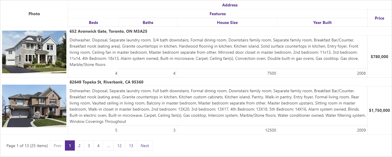
With all the varying sizes of screens that your ASP.NET websites may run on these days, we've added a great new feature to help you display your forms on multiple devices.

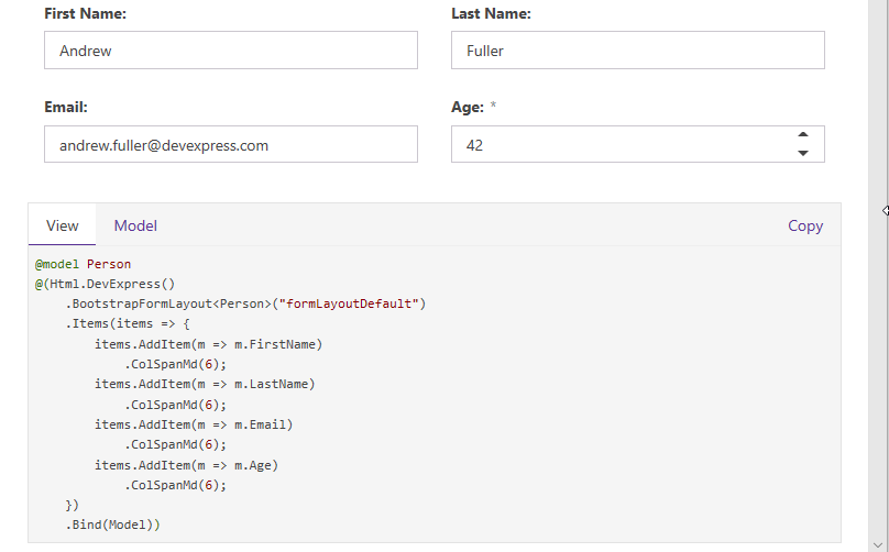
In the next major release, v18.1, the DevExpress ASP.NET and MVC FormLayout control ships with a new mode that allows you to create adaptive layouts with different column counts. So once you enable it, the FormLayout's elements will automatically reflow based on the editor size. This allows you to create, for example, a two-column layout for narrow screens and a three-column layout for wider screens:

Custom Layouts

You will be able to customize your grid layout depending on the FormLayout size. Attached is an example that demonstrates three layouts, but the number of possible variants is not limited. You can create different layouts for each of your devices, if necessary. Column and row spans are also fully supported.

Our R&D team worked hard to make this more powerful, fast and flexible. Let me describe how to create a layout required for your application, and show how this mode works.

1. Create General Layouts

Let's say that I want to create three different layouts that would allow me to display all form editors in different columns based on the screen width:

  1. 0px to 700px width - two columns
  2. 701px to 1100px width - three columns
  3. 1101px to 3000px width - four columns

First, encapsulate all the editors in one LayoutGroup and populate the LayoutGroup.GridSettings.Breakpoints collection with LayoutBreakpoint items:

[ASPx]<dx:ASPxFormLayout runat="server" id="MyFormLayout" width="100%"><Items><dx:LayoutGroup Width="100%" Caption="Registration form"><GridSettings StretchLastItem="false"><Breakpoints><dx:LayoutBreakpoint MaxWidth="700" ColumnCount="2" Name="XS" /><dx:LayoutBreakpoint MaxWidth="1100" ColumnCount="3" Name="M" /><dx:LayoutBreakpoint MaxWidth="3000" ColumnCount="4" Name="XL" /></Breakpoints></GridSettings>
...

The LayoutBreakpoint.ColumnCount property sets how many columns the LayoutGroup should display until the FormLayout reaches the LayoutBreakpoint.MaxWidth property value. The Name property is a unique Breakpoint identifier. It will be used later.

2. Customize Column/Row Spans

Now we can customize the column and row spans for every LayoutItem. For the 'First name' item, I want it to occupy two cells in a row when the LayoutGroup aligns items in two columns. Then, I want the item to occupy three cells in a row when the LayoutGroup aligns items in three columns. And finally, I want the item to occupy two cells in a row again when the LayoutGroup aligns items in four columns.

No row span is required: the item is placed only within its own row. Here's the resulting SpanRules:

[ASPx]<dx:LayoutItem Caption="First name" VerticalAlign="Middle"><SpanRules><dx:SpanRule ColumnSpan="2" RowSpan="1" BreakpointName="XL"></dx:SpanRule><dx:SpanRule ColumnSpan="3" RowSpan="1" BreakpointName="M"></dx:SpanRule><dx:SpanRule ColumnSpan="2" RowSpan="1" BreakpointName="XS"></dx:SpanRule></SpanRules>
 ...

Note that I used the SpanRule.BreakpointName property to bind each SpanRule to a corresponding group layout (use the values that are set in LayoutBreakpoint.Name properties). For brevity, I skipped several items, because they are customized in a similar way. However, you can find the details in the attached project below.

The next one is an item with a RatingControl. I want the item to occupy one cell in a row, but two cells in a column when the LayoutGroup has three or four columns. Then I want the item to occupy one cell in a row and one cell in a column when the LayoutGroup has two columns. Here's the resulting SpanRules:

[ASPx]<dx:LayoutItem Caption=" " VerticalAlign="Middle"><SpanRules><dx:SpanRule ColumnSpan="1" RowSpan="2" BreakpointName="XL"></dx:SpanRule><dx:SpanRule ColumnSpan="1" RowSpan="2" BreakpointName="M"></dx:SpanRule><dx:SpanRule ColumnSpan="1" RowSpan="1" BreakpointName="XS"></dx:SpanRule></SpanRules>
...

Finally, an item with a Button. I want the Button to occupy one cell when the FormLayout is wide:

[ASPx]<dx:SpanRule ColumnSpan="1" RowSpan="1" BreakpointName="XL"></dx:SpanRule><dx:SpanRule ColumnSpan="1" RowSpan="1" BreakpointName="M"></dx:SpanRule>

However, when the FormLayout becomes narrow, the Button should occupy the entire row. Since the LayoutGroup has only two columns when the FormLayout width is less than 700px:

[ASPx]<dx:LayoutBreakpoint MaxWidth="700" ColumnCount="2" Name="XS" />

I add the following SpanRule to the LayoutItem settings:

[ASPx]<dx:SpanRule ColumnSpan="2" RowSpan="1" BreakpointName="XS"></dx:SpanRule>

The default value of ColumnSpan and RowSpan properties is 1. I explicitly added them to markup to illustrate this.

Now take a look at the GridSettings.StretchLastItem setting. If GridSettings.StretchLastItem is enabled and there is some free space after the last item in a row, the last item will be stretched to the row's end.

IMPORTANT NOTE: If you add custom content inside a LayoutItem then please make sure that it is responsive. Unresponsive content prevents an item from collapsing and the adaptive grid layout may appear to be broken.

3. Wrap Captions

You can also have the caption location wrap around the control when there is not enough space to display it next to the control. You can see this behavior in the top gif animation above. Initially, the captions are located to the left of the control when there is enough space. However, once we resize and reach our breakpoints, the caption move above the control.

The GridSettings.WrapCaptionAtWidth property allows you control this behavior.

4. Default Breakpoint

One last piece of info you should be aware of is the default breakpoint. For example, let's say we have the following breakpoints setup:

[ASPx]<Breakpoints><dx:LayoutBreakpoint MaxWidth="500" ColumnCount="1" Name="S" /><dx:LayoutBreakpoint MaxWidth="800" ColumnCount="2" Name="M" /></Breakpoints>

We have an S breakpoint for the 0px - 500px FormLayout width and the M breakpoint for the 501px - 800px width. But if your FormLayout has the width is larger than 800px, the default breakpoint will work. It's possible to set the ColumnCount property for this breakpoint at the LayoutGroup level (or at the FormLayout level):

[ASPx]<dx:LayoutGroup Width="100%" Caption="Registration Form" ColumnCount="3">

And specify the ColumnSpan/RowSpan properties at the LayoutItem level:

[ASPx]<dx:LayoutItem Caption="City" VerticalAlign="Middle" ColumnSpan="2">

Download Sample

Download and run the attached sample project to evaluate this new responsive mode on your local development machine.

Over the last few years, we've steadily provided many responsive and adaptive features to keep our ASP.NET controls modern and up with latest trends. In fact, in the last release (v17.2), we added adaptive support to our Popup control.

We'd love to hear your feedback about the FormLayout control's new Adaptive features and API. Please leave a comment below or contacting our support team if you've got some longer feedback.

Thanks!


Email: mharry@devexpress.com

Twitter: @mehulharry

DevExpress ASP.NET TabControl, PageControl - Tab Swipe (v18.1)

$
0
0

Over the last few years, we've added many responsive and adaptive features to keep our ASP.NET controls modern and relevant with the latest trends. In fact, in the last release (v17.2), we added adaptive support to our Popup control and in this release, we've added Adaptive features to our FormLayout control.

Well, now there's a new feature for the DevExpress ASP.NET TabControl and PageControl that improves usability on mobile devices. Both of these controls now allow for using touch swipe gestures to scroll tabs:

Touch gestures improve user experience on mobile devices. Now your website visitors do not need to tap on small tab arrows. They can just swipe on the tabs.

This feature is available with the DXperience v18.1 release and you can use it with either the DevExpress ASP.NET WebForms or ASP.NET MVC controls.

EnableTabScrolling

To enable this feature, set the EnableTabScrolling setting to true and your end-users will see the tab scroll buttons.

Then, the Tab swipe support is enabled automatically on touch devices.

Download Sample

Test this feature today on your local machine by downloading the attached sample project:

We'd love to hear your feedback about the Tab swipe support. Please leave a comment below, thanks.


Email: mharry@devexpress.com

Twitter: @mehulharry

DevExpress ASP.NET Spreadsheet, RichEdit - Scalability - Amazon Web Services & Azure (v18.1)

$
0
0

Last year, a few customers reported to us the lack of scalability in the DevExpress ASP.NET RichEdit and Spreadsheet controls. These rich controls tend to be larger in memory footprint but the real issue was that they did not work on scalable environments like Microsoft Azure and Amazon Web Services.

After investigating, we figured out a great solution which we released as new feature called: 'stateless mode'. We released this feature in the v17.2 release as a CTP (community technology preview). I recommend that you read the blog post to learn more about 'stateless mode':

Scalability of ASP.NET Office Controls - Azure, Web Gardens, Farms, & Cloud Support (CTP - v17.2)

After releasing the CTP, we've received your feedback and have resolved several issues related to 'stateless mode'. Our customers also confirmed that the new feature helps to solves all the usage scenarios we targeted. Therefore, we're now taking it out of CTP and providing the final version in the v18.1 release. But wait, there's more...

Amazon Web Services

Our initial CTP only supported Microsoft Azure. I'm happy to announce that we now support both Microsoft Azure and Amazon Web Services for scalability!

How to enable it?

To turn on the new feature, set the desired document provider in your project's Global.asax file:

void Application_Start(object sender, EventArgs e) {
    ...
    var provider = new DevExpress.Web.SqlOfficeStateProvider.SqlOfficeStateProvider(connectionString);
    // or
    //var provider = new DevExpress.Web.RedisOfficeStateProvider.RedisOfficeStateProvider(connectionString);
    DevExpress.Web.Office.DocumentManager.StateProvider = provider;
    ...
}

In the sample code above, the connectionString refers to the connection string for your storage.

GitHub Sample

To help you test this, we've created and published a sample repo on GitHub:

https://github.com/DevExpress/aspnet-office-solutions

This repo consist of several solutions and projects:

  • Document state providers:
    • RedisOfficeStateProvider - Redis using document state provider
    • SqlOfficeStateProvider - SQL Server using document state provider
  • New solutions examples for Amazon Web Services:
    • AWS-SqlOfficeStateProvider-Starter - Amazon Web Services solution example using the SqlOfficeStateProvider
    • AWS-RedisOfficeStateProvider-Starter - Amazon Web Services solution example using the RedisOfficeStateProvider

Learn more details on the repo's Readme file.

Logify

Last year we released a new exception logging tool called Logify. If you're using the DevExpress ASP.NET RichEdit and Spreadsheet controls in a scalable evironment like Microsoft Azure then consider also using Logify for exception reporting. We've tested our ASP.NET controls on Microsoft Azure and Logify works handles exception reporting seamlessly.

https://logify.devexpress.com/

Give Us Your Feedback

Are you excited by the DevExpress Office Controls support for scalability? Drop me a line below.

Thanks!

Email: mharry@devexpress.com

Twitter: @mehulharry

ASP.NET & MVC - Rich Editor Control Enhancements (v18.1)

$
0
0

The DevExpress ASP.NET RichEditor is getting some useful end-user enhancements for the v18.1 release. Many of these features below came as a direct result of your (customer) feedback, so thank you. The features are available for both ASP.NET WebForms and MVC versions of the RichEdit too. Let's take a look...

Table of Contents

With this release, we've added support for interactive table of contents. End-users can now move to a specific position within a document instantly. Several types of tables are supported:

  • Table of Contents
  • Table of Figures
  • Table of Tables
  • Table of Equations

You can add/update tables and mark their entries using the Rich Editor's Ribbon UI. Our new API offers numerous options to manage interactive tables.

Test drive the online demo then take a look at the documentation to learn more.

AutoCorrect

Our ASP.NET Rich Text Editor also ships with an AutoCorrect feature that helps you to fix capitalization errors, create numeric lists, hyperlinks and emails, as well as automatically insert symbols and other pieces of text.

You can enable the built-in AutoCorrect feature using the following server-side properties:

  • CorrectTwoInitialCapitals - specifies whether the control should correct words that start with two capital letters by changing the second letter to lowercase
  • DetectUrls - specifies whether the control should detect URI strings and format them as hyperlinks
  • EnableAutomaticNumbering - specifies whether the control should automatically start numbered or bulleted lists when the specific symbols are typed
  • ReplaceTextAsYouType - specifies whether the control should search a replacement for the typed string in the AutoCorrectReplaceInfoCollection collection

Try out the online demo and learn more by reading documentation.

Table AutoFit

A Table in the RichEdit control can now automatically resize columns to fit to its content width or extend to the width of the document window:

Input Method Editor Support (IME)

We've also added support for your end-users to use an Input Method Editor (IME). An IME allows you to use a Latin-based keyboard to enter Japanese, Chinese, Korean, and Tigrinya symbols. The IME is enabled when an end-user switches the desktop key input to a supported language:

Stateless Mode

With our new stateless option, you can use the DevExpress ASP.NET RichEdit control in scalable environments (cloud, web farms, etc). Learn more about this new feature by reading this blog post.

Give Us Your Feedback

Are you excited by the DevExpress ASP.NET RichEdit's new features? Drop me a line below.

Thanks!


Email: mharry@devexpress.com

Twitter: @mehulharry

ASP.NET Bootstrap Core - CLI Templates for ASP.NET Core

$
0
0

The .NET Core command line interface (CLI) allows you to create new projects directly from the console.

We're introducing a set of CLI templates that you can use to create starter cross-platform projects with DevExpress ASP.NET Bootstrap and Dashboard Controls.

This means that you can create ASP.NET Core projects with DevExpress controls on your MacOS, Linux, or Windows consoles!

Install DevExpress CLI templates

Get started by first installing the DevExpress CLI templates. Type the following command in your console:

dotnet new -i "DevExpress.DotNet.Web.ProjectTemplates::\*"

When the template installation command is finished, it will display a list of installed templates on your machine:

You can also run the dotnet new --list command to see this list.

Create new projects

You are now ready to create an ASP.NET Core project with DevExpress controls. Since ASP.NET Core projects mainly use packages, you'll need to use our NuGet packages which are available via the DevExpress NuGet portal.

To get your NuGet feed, please refer to the https://nuget.devexpress.com/#feed-url page.

Note, our templates have one required parameter - feed-{url} (the refers to your personal DevExpress NuGet feed).

You'll need to specify this parameter for creating new projects. For example, if you want create a new project that uses the DevExpress Bootstrap Controls for ASP.NET Core then use the following command:

dotnet new dx.bootstrap -nuget-feed https://nuget.devexpress.com/{auth_key}/api

To create a project with our dashboard:

dotnet new dx.dashboard -nuget-feed https://nuget.devexpress.com/{auth_key}/api

Use -h flag to get a full list of the different parameters on our new CLI commands:

To see list of available functionality that manage of template parameters, use the -h flag:

dotnet new dx.bootstrap -h
dotnet new dx.dashboard -h

Take a look at this video that shows our CLI templates in action:

Learn more

Our new DevExpress CLI templates support ASP.NET Core v2.0 and higher.

Learn more about Microsoft ASP.NET Core CLI by following this getting started guide.

Give Us Your Feedback

What do you love about working with ASP.NET Core CLI templates? Drop me a line below.

Thanks!


Email: mharry@devexpress.com

Twitter: @mehulharry


ASP.NET Core Bootstrap - New Controls (v18.1)

$
0
0

The DevExpress ASP.NET Bootstrap controls for ASP.NET Core is introducing several new controls with our latest release.

These controls are fantastic because they support Bootstrap out-of-the-box and can be run from multiple platforms (MacOS, Linux, & Windows)! Let's take a look.

New ASP.NET Core Bootstrap CardView Control

ASP.NET Core Bootstrap CardView Control

v18.1 ships with our new ASP.NET Card View control for Bootstrap Core. Its features include:

ASP.NET Core Bootstrap CardView Control

Demo

New ASP.NET Core Bootstrap Scheduler Control

v18.1 ships with our new ASP.NET Bootstrap Scheduler control. Its features include:

ASP.NET Core Bootstrap Scheduler Control | DevExpress

Demo

New ASP.NET Core Bootstrap FormLayout Control

Our new Bootstrap ASP.NET Core Form Layout Control allows you to eliminate the restrictions and time consuming limits associated with pixel-based form design.

The Form Layout control supports data binding. You simply bind the Form Layout control to a data source and specify which fields are to be displayed. It is also adaptive, which it makes it possible to use on any device:

ASP.NET Core Bootstrap FormLayout Control | DevExpress

Demo

New ASP.NET Core Bootstrap Sparkline Control

The DevExpress Bootstrap Sparkline control allows you to display a single series chart within containers such as our Grid control. Its features include:

Demo

ASP.NET Core Bootstrap Data Editors

ASP.NET Core Bootstrap Upload Control

The DevExpress Bootstrap Upload Control allows end-users to upload files to the server via the browser. End-users can select a file by invoking the standard Open File dialog or by dragging the file to the Upload control.

Demo

ASP.NET Core Bootstrap TagBox

Our Bootstrap Tag Box control allows users to select values from a drop-down list or to enter them manually.

ASP.NET Core Bootstrap TagBox | DevExpress

Demo

ASP.NET Core Bootstrap Time Editor

The DevExpress Bootstrap Time Edit control allows you to display and edit date-time values. End-users can modify values by typing directly into the edit box or clicking spin buttons to increment or decrement months, days, hours, minutes or seconds.

ASP.NET Core Bootstrap Time Editor | DevExpress

Demo

Navigation

New ASP.NET Core Bootstrap Toolbar

The ASP.NET Core Bootstrap Toolbar Control allows you to supply your web application with a lightweight adaptive toolbar interface. A toolbar is presented as a set of buttons arranged across groups.

Demo

ASP.NET Core Bootstrap Popup Menu

The DevExpress ASP.NET Core Bootstrap Popup Menu is a context sensitive menu that can be associated with a control on a web page.

Demo

Like it?

We'd love to hear your feedback about the new Bootstrap controls for ASP.NET Core. Drop me a line below, thanks.


Email: mharry@devexpress.com

Twitter: @mehulharry

ASP.NET Bootstrap - GridView Enhancements (v18.1)

$
0
0

With our latest release, we introduce several major features for the DevExpress ASP.NET Bootstrap GridView control.

We offer two versions of ASP.NET controls that are built specifically for the Bootstrap framework: ASP.NET WebForms and ASP.NET Core. The features below apply to the ASP.NET WebForms version of our Bootstrap GridView control. Let's take a look.

Bands

Our Bootstrap Grid View control now supports the popular column header and data cell bands feature.

  • Column Header bands allow you to arrange column headers across multiple rows.
  • Data cell bands allow you to create banded data row layouts allowing cells to occupy multiple rows.

ASP.NET Bootstrap GridView Control - Bands

Demo

Cell Merging

Much like Microsoft Excel, the Grid's cell merging option allows you to improve usability by avoiding the duplication of common information. Neighboring data cells across different rows can be merged whenever they display matching values.

You can manage visibility of the Cell merging feature by using the SettingsBehavior.AllowCellMerge and GridViewDataColumnSettings.AllowCellMerge properties.

ASP.NET Bootstrap GridView Control - Cell Merging

Demo

Column Resizing

End-users can now resize grid columns by dragging a column header's border. Take a look at the SettingsResizing property to see the options related to column resizing.

ASP.NET Bootstrap GridView Control - Column Resizing

Demo

Merged Column Grouping

Our ASP.NET Bootstrap GridView now includes a 'Merge Column Groups' mode. In this mode, you can merge grouped columns by dragging the appropriate column header(s) to the group panel and arrange them across a line.

Merged grouping can be controlled by using the SettingsBehavior.MergeGroupsMode property.

ASP.NET Bootstrap GridView - Merged Column Grouping | DevExpress

Demo

Header Filter - Instant Find

v18.1 introduces a simple and quick way to find column filter values. The Find Panel is enabled by default and allows users to enter a search string and initiate a search against all filter values displayed in the header drop-down.

Control the Find Panel's visibility by using the Settings.ShowHeaderFilterListBoxSearchUI and DataColumn.SettingsHeaderFilter.ListBoxSearchUISettings.Visibility properties.

ASP.NET Bootstrap GridView Control - Header Instant Find | DevExpress

Give Us Your Feedback

How are you using the DevExpress ASP.NET Bootstrap GridView control? Drop me a line below.

Thanks!


Email: mharry@devexpress.com

Twitter: @mehulharry

ASP.NET & MVC - Grid Performance Enhancements (v18.1)

$
0
0

With the v18.1 release, we have improved performance of the DevExpress ASP.NET GridView control's adaptive mode. In fact, these enhancements are available for both ASP.NET WebForms and MVC.

Using new internal algorithms, we've significantly improved the layout recalculation logic of the ASP.NET and MVC Grid View in adaptive mode. The control's client Initialization is now up to 6 to 18 times faster when compared to earlier versions.

Adaptive Mode

The DevExpress ASP.NET & MVC GridView controls allow you to build adaptive or responsive page layouts with ease. The grid can automatically resize or hide grid data when the browser window is resized. The layout behavior can be customized by using the SettingsAdaptivity property.

This feature is great for your end-users who view your website from mobile devices.

Performance

Take a look at this animation to see the difference:

The previous version on the left is much slower to update than the improved current version on the right. Here's


GridView v17.2GridView v18.1Performance Efficiency
10 columns / 20 rows1,668 ms280 ms6 times
30 columns / 100 rows52,936 ms2,817 ms18 times

Demos

Test drive the online demos on your devices today:

Thanks!


Email: mharry@devexpress.com

Twitter: @mehulharry

ASP.NET & MVC - Scheduler Enhancements (v18.1)

$
0
0

With our latest release, we have introduced several new features for the DevExpress ASP.NET Scheduler control. These features are available for both the ASP.NET WebForms and ASP.NET MVC versions of the Scheduler.

Standalone Storage Control

The DevExpress ASP.NET Scheduler is a big control that provides several great features and a beautiful user interface (UI). We got some great feedback from you, our customers, who shared with us scenarios of using the Scheduler's features without the UI.

Therefore, we're now providing a new control that helps you to use the Scheduler's functionality without using the Scheduler's UI.

v18.1 ships with a new SchedulerStorageControl. This is a non-visual component that provides nearly the same functionality as our ASP.NET Scheduler. It also allows you to integrate all scheduler-based data operations using third-party web controls.

This stand-alone control allows you to do things like:

  • Display and edit appointments using a custom UI
  • Show reminder notifications without the full scheduler (lighter render)
  • Bind Date Navigator to a Storage Control

The new SchedulerStorageControl also provides a Client-side API to:

  • retrieve the resources data
  • CRUD operations for appointments
  • manage reminders

The Server-side API is the same as the scheduler control.

Demo  Documentation

Resource Navigator - Tokens

Our Resource Navigator ships with a new navigation mode. In this mode, all available resources are displayed as tokens. End-users can display or hide resources by adding or removing corresponding tokens.

This allows your end-users to select individual resources to be displayed in the scheduler view. They can also Search for a resource by name.

This feature is also great for mobile-users to quickly tap on resources they'd like to filter by.

To enable this feature set the ResourceNavigatorProperties.Mode property to "Tokens".

Demo

Date Navigator: New Highlight Modes

Our Date Navigator has added two new modes to highlight dates with appointments. Now there are three highlight modes available in the Scheduler:

  • Bold - date is displayed in bold text
  • Labels - small colored bricks representing appointments
  • Custom - allows you to define custom highlighting logic

Demo

Month View Adaptivity

The Scheduler's Month View now supports an adaptive display mode. All appointments are transformed to a more compact view on smaller screens.

In fact, we've also improved the appointment rendering for small screens. Previously, appointments often were not even shown due to the lack of space. Now with this latest release, we render more compact appointments and date headers.

Give Us Your Feedback

Which ASP.NET Scheduler enhancement is your favorite? Drop me a line below.

Thanks!


Email: mharry@devexpress.com

Twitter: @mehulharry

DevExpress ASP.NET, MVC, Bootstrap, & Core Editors - Performance Improvements & Custom Filtering (v18.1)

$
0
0

With the v18.1 release, we have added two major improvements for all DevExpress ASP.NET list-based controls: ListBox, ComboBox, and TokenBox.

  • Improved performance
  • Custom filtering

These improvements are available for all ASP.NET platforms: ASP.NET WebForms, MVC, Bootstrap, and ASP.NET Core Bootstrap. Let's take a look.

Performance - Client-Side Mode

Let's start with the problem: several customers reported issues with editors and large data sources. Therefore, binding the ListBox, ComboBox, or TokenBox to a data source with several thousands of records (or more). The performance gets worse when using multiple (large data) editors on the same page.

So I'm happy to report that we've solved these issues and dramatically increased performance. The list edit controls can now be used in client mode, therefore, you don't need to use callbacks (even for large number of items). Take a look at this animation to see the difference:

I've said it before and I'll say it again: I love it when our devs can squeeze out even more performance improvements from our controls.

Faster render

The improved performance of these editors can help speed up your websites. Take a look at these tables to see the difference with and without optimizations:

List Box Initialization

No. of ItemsTime, without optimizationTime, WITH optimization
5,000600 - 700 ms130- 180 ms
50,0007 - 8 sec700 - 900 ms
500,000out of memory exception7 - 8 sec

Combo Box Filtering

No. of ItemsTime, without optimizationTime, WITH optimization
5,000200 - 500 ms30- 60 ms
50,00060 sec200 - 600 ms
500,000browser does not respond3 - 7 sec

This results in lighter web pages that load faster and respond smoother:

Render-size Comparison

ControlVersion 17.2Version 18.1
Combo Box (10, 000 items)~1 MB~350 KB
List Box (10, 000 items)~940 KB~370 KB
List Box w/CheckBoxes (10, 000 items)~4.2 MB~370 KB

Custom Filtering

These editors also now support custom filtering which allows you to do several new filtering options:

  1. Create your own filter algorithm and override the default filter in either the client or server modes
  2. Implement custom highlighting logic
  3. Implement server-side custom filtering via Filter Expression using the Criteria Operator syntax
  4. Implement client-side custom filtering via custom code in the event handler (processing each item’s visibility separately)
  5. Added the new client API method which allows you to preset a filter: SetText(string text, bool applyFilter)

Multi-Column Search

You can now also search by multiple terms and columns. For example, here we match the rows for the terms USA and re for any columns:

Accents & Umlauts Filtering

With the improvements in the customer filtering API, you can now create scenarios like accent/umlaut insensitive search.

This allows you to easily search for items that contain accents or umlauts without you having to enter those special characters. For example, by entering mu, the filter matches both Mu and :

We've created a demo with the CustomFiltering event so you can see how to implement this in your projects.

Code Reuse - FTW

These features will also be included with the embedded list editors in our GridView, CardView, VerticalGrid, and TreeList controls. This code reuse allows the embedded controls to "bubble up" new features to the parent control too.

Demos

Test drive these improvements online here:

Feedback

What do you love about these features of the DevExpress ASP.NET List Editor controls? Drop me a line below.

Thanks!


Email: mharry@devexpress.com

Twitter: @mehulharry

ASP.NET Core Bootstrap - GridView Control Enhancements (v18.1)

$
0
0

With the v18.1 release, we've added several major features to the DevExpress Bootstrap GridView control for ASP.NET Core. Let's take a look.

Server Mode - Binding to Large Datasets

The Bootstrap Grid View control now supports data binding in server mode. In this mode, the Grid View loads only the minimum amount of data required for display purposes and delegates all data processing (such as grouping and sorting) to the database server.

Demo

Batch Editing

Our ASP.NET Core Bootstrap Grid View control supports data editing in batch mode. Batch modifications allow you to eliminate unnecessary server updates (visual, re-sorting, selection updates, etc.) and speed up grid performance. You update the grid once, after all necessary changes have been made on a client.

ASP.NET Core Bootstrap GridView - Batch Editing | DevExpress

Demo

Bands

With this release, our Bootstrap Grid View control supports column header and data cell bands.

  • Column Header bands allow yo to arrange column headers across multiple rows.
  • Data cell bands allow you to create banded data row layouts allowing cells to occupy multiple rows.

Demo

Cell Merging

Much like Microsoft Excel, the Grid's cell merging option allows you to improve usability by avoiding the duplication of common information. Neighboring data cells across different rows can be merged whenever they display matching values.

Demo

Column Resizing

End-users can now resize grid columns by dragging a column header's border.

Demo

Merged Column Grouping

Our ASP.NET Bootstrap GridView now includes a 'Merge Column Groups' mode. In this mode, you can merge grouped columns by dragging the appropriate column header(s) to the group panel and arrange them across a line.

ASP.NET Core Bootstrap GridView - Merged Column Grouping | DevExpress

Demo

Header Filter - Instant Find

v18.1 introduces a simple and quick way to find column filter values. The Find Panel allows users to enter a search string and initiate a search against all filter values displayed in the header dropdown.

ASP.NET Core Bootstrap GridView Control - Header Instant Find | DevExpress

Demo

Like it?

We'd love to hear your feedback about the Bootstrap GridView for ASP.NET Core improvements. Drop me a line below, thanks.


Email: mharry@devexpress.com

Twitter: @mehulharry

ASP.NET Core & WebForms Bootstrap - New Scheduler Control (v18.1)

$
0
0

With the v18.1 release, we've added the powerful Scheduler control for both Bootstrap versions of our controls: ASP.NET Core and WebForms.

This new Scheduler controls is packed with several major features, let's take a look.

Various view types

The Bootstrap Scheduler control has several types of view that provide different arrangements and formats for scheduling and viewing appointments:

Day

The DayView enables end-users to schedule and view user events by day.

Demo

Agenda

The AgendaView enables end-users to list appointments by day.

Demo

Full Week

The FullWeekView enables end-users to schedule and view user events for the entire week.

Demo

Work Week

The WorkWeekView enables end-users to schedule and view user events by the working week (Saturdays and Sundays are not displayed).

Demo

Time Line

The TimelineView displays appointments as horizontal bars along the timescales and provides end-users with a clearer overview for scheduling purposes.

Demo

Month

The MonthView enables end-users to schedule and view the user events in a month.

Demo

Grouping

The appointments within the current view can be grouped by dates or resources to facilitate an appointments management.

Group by resources

Appointments are grouped by resources.

Demo

Group by dates

Appointments are grouped by dates.

Demo

No Group by

Appointments with out any grouping.

Demo

Edit Form Customization

The Bootstrap Scheduler provides a ViewModel-driven customization API. This allows to remove, replace, or modify existing form parts or add a new UI parts to the edit forms without re-creating the entire form from scratch.

It provides API methods like: GenerateDefaultLayoutElements, InsertBefore, InsertAfter, FindLayoutElement, and more that allow you to modify the existing layout with ease.

For example:

// generates default layout elements to work with
dialog.GenerateDefaultLayoutElements();
var resourceContainerGroup = dialog.LayoutElements.CreateGroup("resourceContainer", (g) => {
   g.LayoutElements.CreateGroup("resourceGroup", (resourceGroup) => { resourceGroup.LayoutElements.Add(dialog.FindLayoutElement("ResourceIds"));
   // moves existing ResourceIds to the created group
   });
   g.LayoutElements.CreateGroup("resourceDetailGroup", (detailGroup) => {
      detailGroup.LayoutElements.CreateField(m => m.Phone);
      detailGroup.LayoutElements.CreateField(m => m.Photo);
   });
});
dialog.InsertAfter(resourceContainerGroup, dialog.FindLayoutElement("StatusKey"));// inserts group before existing layout element

Demo

Reminders

Scheduler provides a capability to create reminders. Reminders are used to send alerts at specified time periods before an appointment's start time.

Standalone controls

Some parts of the Bootstrap Scheduler control's UI are available as standalone controls, which can be used side by side with the scheduler control.

Here is the list of standalone controls and check out their demos:

  • BootstrapSchedulerDateNavigator -Demo
  • BootstrapSchedulerResourceNavigator - Demo
  • BootstrapSchedulerViewNavigator -Demo
  • BootstrapSchedulerViewSelector - Demo

Adaptive layout

Last, but not least, the Bootstrap Scheduler provides adaptive features out-of-the-box! That means looks great on desktop and mobile browsers!

Like it?

We'd love to hear your feedback about the new Bootstrap Scheduler control. Drop me a line below, thanks.


Email: mharry@devexpress.com

Twitter: @mehulharry


ASP.NET Core Bootstrap - Insert Control Wizard (v18.1)

$
0
0

With the v18.1 release, we've added a helpful wizard for Visual Studio that makes working with the DevExpress ASP.NET Core Bootstrapcontrols easier. Let's take a look.

Insert DevExpress Bootstrap Core Control

The Insert Bootstrap Core Wizard helps by adding a fully functional DevExpress ASP.NET Core control to your project. It generates the code for you which saves you time. Any of the DevExpress Bootstrap for ASP.NET Core controls can be used.

To invoke the wizard in Visual Studio, right-click the design area of a view and select the 'Insert DevExpress Bootstrap Core Control' option:

Then from the dialog, select and customize the Bootstrap control you'd like to add to your view and click Insert:

Now the wizard will generate the necessary code and insert it into your View at the cursor position.

Take a look at this video that shows how to add a DevExpress Bootstrap Grid for ASP.NET Core using this new wizard:

Like it?

We'd love to hear your feedback about the new 'Insert DevExpress Bootstrap Core Control' wizard. Drop me a line below, thanks.


Email: mharry@devexpress.com

Twitter: @mehulharry

Bootstrap ASP.NET WebForms - Layout Control Enhancements (v18.1)

$
0
0

Now that the DXperience v18.1 release is available, let's dive into the new features of our Bootstrap Form Layout control.

The DevExpress ASP.NET Bootstrap Form Layout control helps you to build efficient and adaptive form layouts using the Bootstrap grid system.

Layout Groups

Let's start with the new 'Layout Groups' and 'Tabbed Layout Groups'. These Layout Groups serve as containers for Layout Items and allow you to create well organized forms that look great.

Tabbed Login Form

For example, you can easily create a "Login and Register" tabbed form with the Bootstrap Form Layout control. All you need is one tabbed layout group in the control’s Items collection with two layout groups: 'Login' and 'Register'. These groups contain layout items (with editors) to input typical data that's required to login or register for a website. Here's the sample code outline:

<dx:BootstrapFormLayout runat="server" ID="BootstrapFormLayout1"><Items><dx:BootstrapTabbedLayoutGroup><Items><dx:BootstrapLayoutGroup Caption="Login"><Items>
						...</Items></dx:BootstrapLayoutGroup><dx:BootstrapLayoutGroup Caption="Register"><Items>
						...</Items></dx:BootstrapLayoutGroup></Items></dx:BootstrapTabbedLayoutGroup></Items></dx:BootstrapFormLayout>

Adaptive

The Bootstrap Grid system provides classes for different screen sizes. The DevExpress Bootstrap controls help you to leverage these features of the Bootstrap Grid system.

To help you make your layouts more adaptive, some of the layout items support BootstrapLayoutItem.ColSpanXl / ColSpanLg / ColSpanMd / ColSpanSm / ColSpanXs properties. This allows you to define different values depending on the current screen resolution. For example, here the layout changes column count based on the width:

Non-tabbed

Non-tabbed layout groups are useful to visually separate and group a form's sections without using tabs.

Before the v18.1 release, you would need several Form Layout controls to create non-tabbed layout groups. Now, you can add the required groups or another layout group’s Items collection to the control:

<dx:BootstrapFormLayout runat="server" ID="BootstrapFormLayout1"><Items><dx:BootstrapLayoutGroup Caption="Registration form"><Items><dx:BootstrapLayoutGroup Caption="Authorization Data"><Items>
						...</Items></dx:BootstrapLayoutGroup><dx:BootstrapLayoutGroup Caption="Personal Data"><Items>
						...</Items></dx:BootstrapLayoutGroup><dx:BootstrapLayoutItem ColSpanXs="12">
					...</dx:BootstrapLayoutItem></Items></dx:BootstrapLayoutGroup></Items></dx:BootstrapFormLayout>

Take a look at all of the new features of our Bootstrap Layout control here: ASP.NET Core & WebForms Bootstrap – Layout Control Enhancements (v18.1)

Like it?

We'd love to hear your feedback about the new features of the DevExpress ASP.NET Bootstrap control. Drop me a line below, thanks.


Email: mharry@devexpress.com

Twitter: @mehulharry

Simplifying our ASP.NET Control Suites

$
0
0

Writing for the web these days is very different from that a few years ago. The same goes for our control suites for ASP.NET: over the past decade we've evolved our original WebForms subscription in many different directions, and currently have five different suites, each different from each other, each providing slightly different capabilities:

  • DevExpress ASP.NET Classic WebForms Controls
  • DevExpress ASP.NET Classic MVC Controls
  • DevExtreme MVC Controls (for ASP.NET MVC and ASP.NET Core)
  • DevExpress ASP.NET Bootstrap for WebForms
  • DevExpress ASP.NET Bootstrap for ASP.NET Core

Of course, these choices don't even factor in the other parts of our DevExtreme product that cater to the pure client-side development community.

In essence, it has become more and more complicated and difficult for us to recommend a particular web control suite for new and existing customers. It is past time to simplify things.

We've taken a good long look at what we have, what is being installed and developed with out there, what feedback we have received from customers, and what would make the most sense to change. As a result we have come to the decision to retire the DevExpress ASP.NET Bootstrap for ASP.NET Core suite.

Rationale for the decision

So why simplify? The first reason: less confusion.

In providing two major libraries for use with ASP.NET Core, it was confusing for you, our customers, which library was the best choice. And similarly, confusing for us to make a recommendation. (The main difference between the two products boils down to the DevExtreme MVC controls providing client-side rendering and the DevExpress ASP.NET Bootstrap controls being server-side. As it happens, client-side rendering works extremely well with the ASP.NET Core framework.)

We therefore decided that we will focus on what we believe is the one best solution for ASP.NET Core: DevExtreme MVC Controls for ASP.NET Core.

Second, and more boring perhaps, is the resources problem. Simple and obvious enough to state: by maintaining one product instead of two means that we'll free up development and support resources so that we can introduce new features more quickly and with more impact to you, our customers.

Third, and perhaps more contentious, is that we believe the DevExtreme MVC Controls provide a much better alternative than the Bootstrap suite. For example, the DevExtreme MVC Controls work both with ASP.NET Core and ASP.NET MVC. They leverage modern web approaches by using client-side rendering (JavaScript) and supporting REST API. By having separate data services (Web API), it allows for:

  • Decreased maintenance costs
  • Improved scalability
  • Decoupled server and client (each can be modified independently)
  • Use of the same data API from mobile apps (native or hybrid)
  • Future-proof (client can be replaced with some new modern technology without rewriting the server-side)
  • Improved performance and user experience

This allows the DevExtreme MVC Controls to work better with the new ASP.NET Core framework than do the DevExpress ASP.NET Bootstrap for ASP.NET Core controls. And, of course, the DevExtreme MVC Controls also include support for Bootstrap themes.

Time for maintenance mode

In conclusion, from this point forward, we are placing the DevExpress ASP.NET Bootstrap controls for ASP.NET Core into maintenance mode. Maintenance mode means that the code will continue to work as is, the documentation and demos will stay online, the product is still supported, we will fix bugs when we (or our customers) find them, however, we will not be introducing any new features. Additionally, we have removed the option to purchase or renew the product.

In short, if you're using these controls today, then by all means continue to do so. We do not, however, recommend starting any new projects with this suite, and would ask that you consider switching to our other controls for ASP.NET Core: DevExtreme MVC Controls.

Migration?

The two suites are different enough that unfortunately a direct migration is not possible. If you are already using the Bootstrap-capable controls, here's what I recommend:

  • Just continue using them; after all, even in maintenance mode, they are still supported. Just be aware that you will not get any new features.
  • Start using the DevExtreme MVC controls in your projects (you can use both types of controls in one project), and slowly replace the Bootstrap controls you've used with the DevExtreme MVC controls.
  • For new projects, just use the DevExtreme MVC controls

Future Plans

We'll continue to grow these existing DevExpress ASP.NET offerings:

  1. DevExtreme MVC Controls (for ASP.NET MVC and ASP.NET Core) - This is a robust library that works great for both ASP.NET MVC and ASP.NET Core. If you want to use ASP.NET Core then use DevExtreme MVC Controls.

  2. DevExpress ASP.NET Boostrap for WebForms - Currently, we only offer 35+ controls for Bootstrap (WebForms). We plan to increase this number and bring over the major office controls too (Spreadsheet and RichEdit). In general, if you use our classic controls ASP.NET WebForms then you should consider using the DevExpress ASP.NET Bootstrap controls for ASP.NET WebForms instead.

  3. DevExpress ASP.NET Classic WebForms Controls - This amazing library of controls offers over 100+ controls and several great features.

  4. DevExpress ASP.NET Classic MVC Controls - The ASP.NET MVC version of our Classic WebForms Controls, this library is another popular choice for developers. Learn more about our MVC controls offerings here.

Feedback

We'd like hear your feedback about this topic:

  1. Have you used DevExtreme MVC Controls with the ASP.NET Core framework yet?
  2. What prevents your from using DevExtreme MVC Controls?
  3. What controls and/or features are you missing from DevExtreme MVC Controls?

Thanks.


Email: mharry@devexpress.com

Twitter: @mehulharry

Free DevExpress Bootstrap 4 Themes

$
0
0

We've created two beautiful new themes and, not only that, we've made them open source so you can download them for free! These themes were expressly created for websites that were built using Bootstrap v4 or later.

Check out the new themes:

DevExpress Purple

DevExpress OfficeWhite

We strive to create beautiful themes for our controls and these new Bootstrap themes are no exception.

The new DevExpress OfficeWhite and Purple Bootstrap themes are designed with the same clean aesthetic as our modern ASP.NET themes like 'Mulberry', and 'Moderno'. In fact, the OfficeWhite theme was inspired by our 'Office365' ASP.NET theme.

Demos: https://devexpress.github.io/bootstrap-themes/

GitHub

Download, or clone, the themes from the open source GitHub repository here:

https://github.com/DevExpress/bootstrap-themes

Open Source (MIT)

We're making these two new Bootstrap themes available under the MIT open source license. This license type allows you to:

  • Use the themes for free
  • Modify the themes too

It's rare but occasionally we'll provide some of our open source projects under the permissive MIT license.

So why are these new DevExpress Bootstrap themes available for free?

Spread the word

Since launching the DevExpress ASP.NET Bootstrap Controls for ASP.NET WebForms, we've been thinking about how to get the word out about these fantastic controls.

The Bootstrap framework is widely used and offers a rich ecosystem of themes. We want your help in spreading the word about the DevExpress ASP.NET Bootstrap controls.

So download the free themes, use them in your Bootstrap enabled websites, and then tell a friend.

Feedback

Which theme do you like better, DevExpress OfficeWhite or Purple? Drop me a line below, thanks.


Email: mharry@devexpress.com

Twitter: @mehulharry

ASP.NET and MVC Subscription - v18.2 and What You Can Expect in mid-November

$
0
0

Check out this list of upcoming v18.2 release features that we're working on for our ASP.NET line of controls. We've also prepared a special v18.2 CTP with online demos that you can see in your browser now.

If you are an active Universal subscriber and would like to test our most recent features prior to official release, please email our support team at support@devexpress.com or create a private support ticket in the DevExpress Support Center. Once we verify that you own an active Universal Subscription, we'll get you access to the v18.2 CTP. Feel free to test any of the following features and share your feedback with us!

WebForms and MVC

ASP.NET Spreadsheet and MVC Spreadsheet Extension

Pivot Table

Pivot Tables allow end-users to calculate, categorize and analyze data within a worksheet. Our ASP.NET and MVC Spreadsheet's pivot table displays a summary table that breaks the data into categories and calculates subtotals without entering any formulas.

    Available for CTP:

https://demos.devexpress.com/preview/ASP/ASPxSpreadsheetDemos/PivotTables.aspx

https://demos.devexpress.com/Preview/MVC/Features/PivotTables

Cross sheet formula editing

End-users can now use cell values from other sheets to create formulas for the active sheet.

ASP.NET Rich Text Edit / MVC Rich Text Edit Extension

Simple View

Our new Simple View mode displays documents while ignoring the page's layout. In this mode, the control adjusts the document so that it occupies the control's entire content area.

    Available for CTP:

https://demos.devexpress.com/preview/ASP/ASPxRichEditDemos/SimpleView.aspx

https://demos.devexpress.com/Preview/MVC/BarsAndUI/SimpleView

ASP.NET Calendar and ASP.NET DateEdit / MVC Calendar and DateEdit Extensions

Month-Year Picker

You can now specify which control view (days, months, years, centuries) an end-user can use to navigate and to select dates.

    Available for CTP:

https://demos.devexpress.com/preview/ASP/ASPxEditorsDemos/MonthYearPicker.aspx

https://demos.devexpress.com/Preview/MVC/Editors/MonthYearPicker

ASP.NET Bootstrap

FormLayout

Data Binding

Each layout item contains a DevExpress data editor that allows users to edit values of the corresponding field type. If no items are specified explicitly, the Form Layout control automatically generates layout items with suitable editors for each data field.

    Available for CTP:

https://demos.devexpress.com/Preview/Bootstrap/Layout/FormLayout.aspx

New Bootstrap File Manager control

    Available for CTP:

https://demos.devexpress.com/Preview/Bootstrap/FileManager/Default.aspx

New Bootstrap Ribbon Control

    Available for CTP:

https://demos.devexpress.com/Preview/Bootstrap/Navigation/Ribbon.aspx

Bootstrap GridView

Scrolling and Paging

Our upcoming release will include a number of highly popular scrolling/paging modes:

  • Vertical scrolling

  • Horizontal scrolling

  • Virtual paging

  • Endless paging

  • Fixed columns

      Available for CTP:

https://demos.devexpress.com/Preview/Bootstrap/GridView/ScrollingAndPaging.aspx

Bootstrap CardView

Scrolling and Paging

Like our Bootstrap GridView, our CardView will be updated to support the following scrolling/paging modes:

  • Vertical scrolling

  • Endless paging

  • Endless paging on Page Scroll

      Available for CTP:

https://demos.devexpress.com/Preview/Bootstrap/CardView/ScrollingAndPaging.aspx

Features We'll Release in November

WebForms and MVC

ASP.NET GridView / MVC GridView Extension

Callback Support in Batch Edit mode

Callbacks won't cause unsaved data loss in Batch Edit mode. End-users need not save data to execute sorting, filtering, paging, grouping and similar operations. For example, end-users can edit cells on several data pages and then update data within a single callback.

Preview Changes in Batch Edit support

Inserted, edited and deleted rows can be previewed and modified before data is saved in Batch Edit mode. The GridView displays only modified rows in Preview mode. This mode is useful when multiple modified rows exist across different data pages.

Improved Adaptivity in Fixed Table Layout Mode

MinWidth and MaxWidth properties will be added to ASP.NET GridView columns to improve column adaptivity when fixed table layout mode is enabled.

ASP.NET CardView / MVC CardView Extension

Grouping

End-users can group CardViews by one or multiple data columns.

ASP.NET Scheduler / MVC Scheduler Extension

Performance Enhancements

Based on customization settings and the current view, performance has been improved by 1.25 – 2.8 times in Edge, 1.1 – 2.6 times in Chrome.

Appointment Tooltip for Mobile

To use screen space more efficiently, an appointment tooltip will be displayed at bottom of the screen on mobile devices.

View Visible Interval Navigator Adaptivity

This will improve the View Navigator's customization and adaptivity features. Take a look at this image to see a mockup.

Floating Action Button

This button provides quick access to the most popular Scheduler user actions. The actions in the button differ based on current context (a selected appointment, a view).

ASP.NET PivotGrid and MVC PivotGrid Extension

Unbound Column for OLAP Data Source

In v18.2, we will introduce an Unbound Column for Pivot Grids connected to OLAP Data Source via code. You can create an Unbound Column, assign an MDX expression string to it, and the column will be calculated via Analysis Services.

Pivot Grid In-memory Data Processing Performance

We continue to improve the Pivot Grid's in-memory data processing. The following features are now processed by the pivot grid in Optimized Mode:

  • Custom Types
  • Custom Totals
  • UseNativeTypeForAggregates
  • CustomSummary event (not available in CTP)
  • CustomGroupInterval event (not available in CTP)
  • Legacy TopN (not available in CTP)
  • CustomUnboundFieldData event (not available in CTP)
  • Case-sensitive data binding (not available in CTP)

ASP.NET and MVC Web Chart Control

Advanced Pane Layout

Diagram Pane items now support a tabular layout mode. Every Pane will include a title element and an expand/collapse button that allows you to maximize a specific chart region. With this feature, it will be easier to build dashboard-like layouts by grouping Series into separate Panes and maximize a Series group at runtime.

Crosshair Panel Improvements

It is now possible to display Indicator data in the Crosshair Panel.

ASP.NET FileManager and ASP.NET UploadControl / MVC FileManager and UploadControl

OneDrive and Google Drive Support

You can now manage files and folders in One Drive and Google Drive via our ASP.NET and MVC FileManager. Upload Control provides direct upload to both cloud storage mediums.

ASP.NET ComboBox and ASP.NET TokenBox / MVC ComboBox and TokenBox Extensions

Server Mode data source support

Both components support LinqServerModeDataSource, EntityServerModeDataSource or XpoDataSource data sources. Server Mode will function much as it does in the DevExpress ASP.NET/MVC GridView

ASP.NET Menu and ASP.NET NavBar / MVC Menu and NavBar Extensions

Collapse to images

To help reduce control width when the browser screen is too narrow, our ASP.NET Menu and NavBar hide item text and only display item icons.

ASP.NET WebForms and MVC Adaptive Project Template

All pages within our adaptive project templates now have adaptive layout. This template provides a quick start for mobile applications development.

ASP.NET Bootstrap

New Bootsrap Spreadsheet Control

New Bootstrap Rich Text Edit Control

FormLayout

Data annotation Attributes

The following data annotation attributes will be supported:

  • BrowsableAttribute
  • RequiredAttribute
  • RegularExpressionAttribute
  • RangeAttribute
  • DisplayFormatAttribute
  • DisplayAttribute
  • DataTypeAttribute

Thanks.

Viewing all 372 articles
Browse latest View live