Quantcast
Channel: ASP.NET Team Blog
Viewing all 372 articles
Browse latest View live

Blazor Roadmap – What You Can Expect in the Next Few Months from DevExpress

$
0
0

Here’s a quick post on our upcoming development plans for Blazor. We expect to publish blog posts on each of these Blazor components in the next couple of months.

If you’re targeting Blazor for an upcoming project and would like to participate in our beta (August, 2019), please send an email to support@devexpress.com.

DevExpress-Blazor-Roadmap

New Blazor UI components

Products we expect to ship by Sept, 2019:

  • Scheduler
  • Charts
  • Popup control (modal mode only)
  • Toolbar
  • Popup menu
  • Calendar
  • TreeView
  • ListBox

Updated Blazor UI components

New features we expect to add to our existing Blazor product line:

Data Grid

  • Grouping
  • Filter enhancements
  • Multiple row selection
  • Virtual Scrolling
  • Master-detail support

Combo Box

  • Filtering support
  • Multiple column support
  • Custom values support

Should you have any questions, please feel free to comment below.


ASP.NET Rich Text Editor (for WebForms, MVC, .NET Core and Bootstrap) - New Client HTML Printing

$
0
0

In our most recent update (v19.1), we added client HTML printing support to our ASP.NET Rich Text Editor (this support is available to WebForms, MVC, Core, and Bootstrap versions of the control library).

Why New Client-side Printing?

In previous versions, our Rich Text Editor shipped with server-side printing support (for purposes of this blog post, I’ll refer to our old implementation as server-side printing). When printing was initiated on the server, our RichEdit Document Server generated a PDF document on the server using a server-side document model. Once prepared, the browser downloaded the document for subsequent printing.

The primary disadvantage of server-side printing is that the server-side document model does not have exact document layout information from the client-side. As a result, the PDF file’s layout differs from the one displayed within the browser. For example, if you print the following text block in our Rich Text Editor:

ASPNET-RichEdit-ClientPrinting

      you’ll obtain a slightly different result in the PDF file:

ASPNET-RichEdit-ClientPrinting

Though these differences may seem inconsequential, they are essential for some of our customers. Our new client-side printing engine resolves these minor discrepancies so that end-users can print what they see on-screen.

The Basics of Our New Client-side Printing Engine

Client-side HTML printing doesn’t initiate any server requests. Our Rich Text Editor opens a new browser tab, renders document layout (HTML markup) within this tab and activates the default print dialog of the web browser.

How to Enable Client HTML Printing

Please note that server-side printing is enabled by default. To switch your apps to client-side printing, set the PrintMode property to ClientHtml:

ASPxRichEdit1.Settings.Printing.PrintMode = PrintMode.ClientHtml;

Once you start using our client-side printing option, the same text block that was slightly altered when sent to PDF (server-side printing), is now identical to that displayed within the browser:

ASPNET-RichEdit-ClientPrinting

See Print Out a Document for more information on this new client-side printing option.

Limitations

  • Client-side print performance is driven by document size and information complexity. Simple documents are printed faster than the server-side counterpart. Complex documents may take longer to print.
  • Paper format in Printer settings must be the same as the paper format used in the RichEdit (otherwise, the browser will split content incorrectly).

Feedback

We want to hear your thoughts. Please tell us what you think of this new capability and how you expect to use it in an upcoming project. Are you currently happy with our server-side print implementation? Do you expect to you use this new client-side print option?

ASP.NET AJAX Control Toolkit v19.1.0 - Now Available

$
0
0

A few years ago, we took over maintenance and guidance for the ASP.NET AJAX Control Toolkit project. Please refer to this blog post for more information on the project and why we stepped in to assist.

As part of our ongoing commitment to the project, we’ve released an update (ASP.NET AJAX Control Toolkit v19.1.0) to address the following issues.

Improvements

  • Visual Studio 2019 Support
  • Security hardening: HTML-encode file names in AjaxFileUpload (#483)

Resolved Issues

  • AutoCompleteExtender: the TextChanged event is not fired in Edge (#458)
  • Rating: The raise_mouseOver method has an invalid argument name (#461)
  • AsyncFileUpload changes the frame target to _top (#466)
  • HtmlEditorExtender unconditionally removes tags with data URLs (#467)
  • NRE in IsLocalizationEnabled() within a PageAsyncTask (#486)

Ready to Upgrade?

To update the ASP.NET AJAX Control Toolkit, please download our most recent installer using the link below.

Download

Or, if you prefer, use Nuget:

ASP.NET AJAX Control Toolkit Nuget package

As always, we welcome your feedback. Please share your thoughts on this update via GitHub.

Want More? Try the DevExpress ASP.NET Subscription for 30-days

We’d like to thank you for installing the DevExpress Edition of the AJAX Control Toolkit and look forward to your feedback as you begin leveraging its capabilities.

If you require additional UI controls for your ASP.NET WebForms application, we invite you to download and try a free 30-day evaluation of our ASP.NET Subscription. With over 100 UI controls, the DevExpress ASP.NET Subscription helps you build your best, and deliver elegant line-of-business applications in the shortest possible time. For a complete list of products and features in our ASP.NET Subscription, please refer to the following webpage.

DevExpress UI for Blazor - Preview 11 - New Blazor TreeView Component and Enhanced ComboBox Features (Now Available)

$
0
0

Preview 11 of the DevExpress UI for Blazor is now available and it includes a new TreeView component and enhanced features for the ComboBox component.

Blazor UI Components – New Blazor TreeView Component

If you’re targeting Blazor and need to use a TreeView in your project, take a look at the following demo for more information on our new Blazor TreeView UI control.

DevExpress Blazor TreeView Component

This new components presents hierarchical data within a tree structure. Parent nodes can be collapsed or expanded – and individual nodes can be selected as necessary. The component ships with three API events to manage component behavior.

Blazor ComboBox

Preview 11 ships with several enhancements to our Blazor ComboBox.

Allow User Input

The component allows end-users to enter custom text into the text box when the value does not match a drop-down item. To enable this feature, set the AllowUserInput property to true.

To learn more, see to Combo Box - Allow Input online demo.

Filtering

Our Blazor ComboBox supports two filter modes and now allows end-users to locate combobox items more quickly. Assign “Contains” or “StartsWith” to the FilteringMode property to enable the desired filter mode.

To learn more, see the Combo Box - Incremental Filtering demo.

Keyboard Support

To help improve the end-user experience, Preview 11 includes built-in Keyboard Support. At present, the following shortcuts are supported:

  • Alt+Up or Alt+Down – Toggles the drop-down window
  • Up/Down – Moves focus to the previous/next item within the drop-down window
  • PageUp/PageDown - Scrolls 5 rows (up or down) within the drop-down window
  • Ctrl+Home/Ctrl+End – Scrolls and moves focus to the first/last item in the drop-down window

Blazor Demo Redesign

As our Blazor component library grows, so does our online demo collection. We used our new TreeView to simplify navigation within the demo and updated the appearance of the demo with the ‘Pulse’ Bootstrap theme.

Your Feedback Matters

We want to hear from you. If you’re currently using Blazor, or expect to do so in the near future, please share your thoughts with us below.

ASP.NET Bootstrap Scheduler - UI Enhancements for Mobile Devices

$
0
0

We’ve extended the capabilities of our ASP.NET Bootstrap Scheduler control in our most recent release (v19.1) with the following mobile-specific features:

Date Navigator UI

We redesigned the control’s Date Navigator UI. We removed the 'Today' button and made the date item clickable. Once clicked, a calendar UI element appears on-screen (used for date selection). By making this change, we saved space and moved the 'previous date' and 'next date' buttons closer to one another.

Bootstrap Date Navigator in v18.2:

DevExpress Bootstrap Scheduler

Bootstrap Date Navigator in v19.1:

DevExpress Bootstrap Scheduler

Demo

Date Highlighting within the Date Navigator

Our Bootstrap Date Navigator can now display appointment marks within individual date items.

DevExpress Bootstrap Scheduler

As you can see, this feature makes it easier to find free or busy days within one’s schedule.

View Selector Adaptivity Enhancements

We upgraded View Selector adaptivity. The following animation demonstrates the difference between our new release and its predecessor.

DevExpress Bootstrap Scheduler

Built-in Floating Action Button

The Bootstrap Scheduler includes built-in Floating Action buttons. These buttons already support key scheduler-related actions (such as adding, editing or deleting appointments).

You can customize the Floating Action button and introduce custom actions as needed. In this demo, we replaced our predefined user actions with custom actions.

DevExpress Bootstrap Scheduler

Demo

As always, we’d love to hear your feedback. Please tell us how you’re using our ASP.NET Scheduler on mobile devices? How likely are you to use these features in your next Bootstrap application?

ASP.NET Core File Manager – Thumbnail Generator Service

$
0
0

Our most recent release (v19.1) includes a new ASP.NET Core File Manager control. Though the component is currently available as a Community Tech Preview (CTP), our customers tell us they’ve already put the control to use in real applications.

In this post, I’ll demonstrate how you can enable preview thumbnails for image files within the ASP.NET Core File Manager control.

Preview Thumbnails

Image thumbnails are important UI elements within all modern file explorers (be it Explorer on PCs or Finder on Macs).

DevExpress-ASPNETCore-FileManager

At present, our File Manager displays default thumbnails for all files. We will support preview thumbnails in a future release. If you’re already using the File Manager in your web app, you can introduce image previews via our Thumbnail Generator service. Simply add it to your project to enable image previews.

Under the Hood

The ThumbnailGeneratorService.cs file contains the code needed to generate custom thumbnails. We use the System.Drawing.Common library to create icons based on your image files.

How to Install

  1. Add the ThumbnailGeneratorService.cs file to your ASP.NET Core Web Application without any modifications.

  2. Register the service in the Startup.cs file:

services
    .AddSingleton<IActionContextAccessor, ActionContextAccessor>()
    .AddSingleton<IThumbnailGeneratorService, ThumbnailGeneratorService>()
  1. Сreate a new method (e.g. FileSystem) in a controller to inject the ThumbnailGenerator service using Dependency Injection:
public IActionResult FileSystem(FileSystemCommand command, string arguments) {
  var config = new FileSystemConfiguration {
      FileSystemProvider = new DefaultFileProvider(rootPath,
          ThumbnailGenerator.AssignThumbnailUrl),
          // ...
       };
       var processor = new FileSystemCommandProcessor(config);
       var result = processor.Execute(command, arguments);
       return Ok(result.GetClientCommandResult());
 }
  1. Assign a custom icon URL to each File Manager item in the customizeThumbnail method:
$(function(){
    $("#fileManagerContainer").dxFileManager({
       // ...
       customizeThumbnail: function (fileManagerItem) {
          return fileManagerItem.dataItem ? fileManagerItem.dataItem.thumbnailUrl : null;
       }
    });
});

You should not see image thumbnails within the DevExpress File Manager control.

DevExpress-ASPNETCore-FileManager

Unix-based Systems

If you encounter the "System.TypeInitializationException: The type initializer for 'Gdip' threw an exception. ---> System.DllNotFoundException: Unable to load DLL 'libgdiplus': The specified module could not be found" exception, please install GDI+.

MacOS

For MacOS systems, call the following command into terminal to install GDI+:

brew install mono-libgdiplus

Survey

We'd love to hear your feedback.


DevExpress UI for Blazor - Virtual Scrolling in Preview 12 (Now Available)

$
0
0

Preview 12 of the DevExpress UI for Blazor is now available and it includes virtual scrolling support for two of our Blazor components.

If you’ve not yet reviewed our Blazor product line, please be certain to check out our Blazor Components webpage. If you are new to Blazor, feel free to review our 5-part Blazor training videos on YouTube.

What's New

Data Grid - Virtual Scrolling

The DevExpress Blazor Data Grid now supports virtual scrolling – allowing your end-users to navigate individual grid rows via the control’s vertical scrollbar.

Use the DataNavigationMode property to enable virtual scrolling:

<DxDataGrid Data=@DataSource
  ...
  DataNavigationMode="@DataGridNavigationMode.VirtualScrolling"
  ...</DxDataGrid>

ComboBox - Virtual Scrolling

The DevExpress Blazor ComboBox can now load visible items within its drop down list (loads data virtually and on demand). This improves performance when binding to a large dataset.

Set the DataLoadMode property to enable virtual scrolling:

<DxComboBox Data=@Strings
  DataLoadMode="@ComboBoxDataLoadMode.VirtualScrolling"
  FilteringMode="@FilteringMode.Contains"
  @bind-SelectedItem=@SelectedItem></DxComboBox>

Demos

You can test our new virtual scrolling demos using the following links:

Download the Preview from NuGet

Our most recent version is available via the DevExpress NuGet Early Access feed:

https://nuget.devexpress.com/early-access/api

If you are a new user, please refer to this article to get started with Blazor today.

This preview is made available under the DevExpress Blazor UI license.

To obtain the build, you will need a DevExpress.com account. Create your free account online or contact us for assistance.

Watch the Webinar

Your Feedback Matters

DevExpress Blazor - Update Metadata at Runtime - Free SEO Tool

$
0
0

In this blog post, I'll discuss a limitation in the Blazor framework and our new utility designed to address it.

As you may know, the Blazor framework does not provide any way to change a document's metadata at runtime (for document metadata: page title, meta tags, and other SEO-related data).

Our utility fixes this issue and is available free of charge.

How to Use the DevExpress SEO Metadata Utility

To get started, you'll need to add our SEO Metadata Utility to your project:

  1. Download the DevExpress Document Metadata project source code from GitHub.
  2. Add the Document Metadata project to your Blazor solution in Visual Studio.

Then follow these steps to learn how to configure the tool.

Server Side Blazor

I'll discuss the server side approach first. Details on the client-side approach are below.

How to Add Default Document Metadata

  1. Add the DocumentMetadata component to a page header:
<head>
    @(await Html.RenderComponentAsync<DocumentMetadataComponent>())
    ...</head>
  1. Call the AddDocumentMetadata() extension method to register default document metadata:
using DevExpress.Blazor.DocumentMetadata;
namespace BlazorDemo.ServerSide
{
    public class Startup
    {
        public void ConfigureServices(IServiceCollection services)
        {
            services.AddDocumentMetadata((IServiceProvider serviceProvider,
                IDocumentMetadataRegistrator registrator) => {
                registrator.Default()
                    .Title("Blazor UI Components")
                ...
            });
        }
        ...
    }
}

Note, the registrator.Default() method returns a document metadata builder. Use this builder to register metadata defaults for all pages:

registrator.Default()
    .Base("~/")
    .Charset("utf-8")
    .TitleFormat("Demo: {0} | DevExpress")
    .Viewport("width=device-width, initial-scale=1.0")
    .OpenGraph("url", https://dxpr.es/2WogLq7)
    ...

How to Add Custom Document Metadata

  1. You can also load metadata from a database, text file, or any other supported storage location. For example, in our demo application, we store the pages' metadata in a 'DemoConfiguration' section of the appsettings.json file:
{"DemoConfiguration": {"SiteMode": false,"DemoPages": [
      {"Url": "","Title": "Blazor UI Components","NavLinkText": "Overview","Icon": "images/Overview.svg","IsUpdated": true,"TitleFormat": "Demos: {0} | DevExpress"
      },
      {"Url": "GridColumnTypes","Title": "Grid - Column Types","Icon": "images/GridColumnType.svg"
      },
      ...

The following code loads metadata from appsettings.json:

services.Configure<DemoConfiguration> Configuration.GetSection("DemoConfiguration"));
  1. Call the AddDocumentMetadata() method to add custom metadata to web pages:
services.AddDocumentMetadata((serviceProvider, registrator) => {
    var config = serviceProvider.GetService<IOptions<DemoConfiguration>>().Value;
    config.RegisterPagesMetadata(registrator);
});

The config.RegisterPagesMetadata() method populates the service with custom metadata. The following code assigns default metadata for all pages and also specifies the page title for each page:

public class DemoConfiguration
{
    public List<DemoPageConfiguration> DemoPages { get; set; }
    public void RegisterPagesMetadata(IDocumentMetadataRegistrator registrator)
    {
        registrator.Default()
            .Charset("utf-8")
            .TitleFormat("Demo: {0} | DevExpress"); 
        DemoPages.ForEach(pageMetadata => {
            IDocumentMetadataBuilder metadataBuilder = registrator.Page(pageMetadata.Url);
            metadataBuilder.Title(pageMetadata.Title);
            if (!string.IsNullOrEmpty(pageMetadata.TitleFormat))
                metadataBuilder.TitleFormat(pageMetadata.TitleFormat);
        });
    }
}

The TitleFormat() method sets the format for text assigned using the Title() method. If the page title format is not set then the page title is displayed as is.

Client-Side Blazor

Client-side Blazor apps present a challenge because they only render page markup after the web assembly has been loaded. Since search engine crawlers do not read web assembly files, they only get to scan simple HTML pages with static content and meta tags.

So, to update metadata for a client-side Blazor application, you'll need to create both a server-side and client-side Blazor projects. The client-side project code is compiled to a web assembly and will work in the end user's browser. While the server-side project will host the client-side project on your server, deliver the web assembly to the client,and handle requests to the server side. This approach is based on Microsoft's recommendation for Client-side Blazor applications with pre-rendering.

How to Add Default Document Metadata

If you want to add default meta tag set for all Blazor application pages, add metatags to the Page/_Host.cshtml page located in the server-side project. You can see an example of this here.

How to Add Custom Document Metadata

  1. Enable pre-rendering in your blazor application because it allows you to add page-specific meta tags and improve your website's SEO parameters. Start by adding a reference to your client-side Blazor project to the server-side Blazor project:

DevExpress Blazor SEO Tool

Then call the app.UseClientSideBlazorFiles() method in the server-side application's Startup.cs file. Use the client-side application's Startup class as a generic parameter:

public void Configure(IApplicationBuilder app, IWebHostEnvironment env)
{…
    app.UseClientSideBlazorFiles<ClientSide.Startup>(); 
    app.UseHttpsRedirection(); 
    app.UseStaticFiles();
    app.UseRouting();
    app.UseEndpoints(endpoints =>
    {
        endpoints.MapDefaultControllerRoute();
        endpoints.MapFallbackToPage("/_Host");
    });
}
  1. Once page pre-render is enabled, call the render the RenderStaticComponentAsync() method with the DocumentMetadata component in the Page/_Host.razor page of your server-side Blazor application:
<head>
    @(await Html.RenderStaticComponentAsync<DocumentMetadataComponent>())</head>

Note that no additional content is allowed inside the 'head' tags in this case.

  1. Register the DemoConfiguration options and the DocumentMetadata service in both client-side and server-side Blazor projects:
services.AddSingleton<IOptions<DemoConfiguration>, ClientSideDemoConfiguration>(); services.AddDocumentMetadata((serviceProvider, registrator) =>
{
    DemoConfiguration config = serviceProvider.GetService<IOptions<DemoConfiguration>>().Value;
    config.RegisterPagesMetadata(registrator);
});

The appsettings.json configuration file is not transferred to the client side. Therefore, page metadata is populated in the PopulateDemoPages() method of the DemoConfiguration class.

void PopulateDemoPages()
{
    DemoPages.Add(new DemoPageConfiguration() {
        Url = "",
        Title = "Blazor UI Components",
        NavLinkText = "Overview",
        Icon = "images/Overview.svg",
        IsUpdated = true,
        TitleFormat = "Demos: {0} | DevExpress"
    });
    DemoPages.Add(new DemoPageConfiguration() {
        Url = "GridColumnTypes",
        Title = "Grid - Column Types",
        Icon = "images/GridColumnType.svg"
    });
…

Since we have a reference to the client-side Blazor project in the server-side project, this class is available in both projects. You can use it in the server-side Blazor project instead of appsettings.json.

  1. Add the DocumentMetadata component to the Components Application Builder in your client-side Blazor project:
public void Configure(IComponentsApplicationBuilder app)
{
    app.AddComponent<App>("app");
    app.AddComponent<DocumentMetadataComponent>("head");
}

This way, the DocumentMetadata component renders content inside the 'head' HTML tag when an end-user changes web pages in a browser.

The SEO tool is now enabled.

Source code

You can find the SEO Metadata tool source code here:

https://github.com/DevExpress/Blazor/tree/master/tools/DevExpress.Blazor.DocumentMetadata

An example of a server-side Blazor application with the use of the SEO Metadata tool:

https://github.com/DevExpress/Blazor/tree/master/demo/BlazorDemo.ServerSide

An example of a client-side Blazor application with the use of the SEO Metadata tool:

https://github.com/DevExpress/Blazor/tree/master/demo/BlazorDemo.ClientSideWithPrerendering

Your Feedback Matters


ASP.NET Spreadsheet - Enhancements (v19.1)

$
0
0

In our most recent update (v19.1), we added two major enhancements to our ASP.NET Spreadsheet (the features described herein are available for the WebForms, MVC, Core, and Bootstrap versions of the DevExpress Spreadsheet control).

Client-Side API Enhancements

We've added a new client-side Print command so you can easily invoke the browser's Print dialog.

DevExpress-ASP-Spreadsheet-ClientPrint

<script>
        function onPrintButtonClick(s, e) {
            spreadsheet.Print("_self");
        }</script><dx:ASPxButton runat="server" Text="Print document" AutoPostBack="false" Image-IconID="actions_print_16x16devav"><ClientSideEvents Click="onPrintButtonClick" /></dx:ASPxButton>
Note: Send "_self" to the Print method to display the print dialog on the same page. To display the dialog on a new page, send "_blank" to the method.

If the browser does not support printing, you can export your workbook to PDF. To learn more about client-side printing, please take a look at this blog post.

Culture-Specific Format

The Format Cells dialog allows you to apply culture-specific formatting to date and numeric values.

DevExpress-ASP-Spreadsheet-CultureFormat

Сulture-specific formatting is applied to a date or numeric cell values based on the current culture (locale). Use the following steps to change the default locale for the Date values:

  • Select a cell or cell range to format
  • Right click on the selection and choose the "Format Cells" menu item
  • Click the Date category on the left side of the dialog
  • Using the "Locale" combo-box, choose a country or region that uses the required date format
  • Select the required date format. The Sample region on the dialog will display a preview of the formatted value
  • Click "OK" to apply the changes

You can also change the default locale for Time, Currency and Accounting type values.

Feedback

We want to hear your thoughts. Please tell us what you think of these new capabilities and how you expect to use it in an upcoming project. Are you currently happy with our server-side print implementation? Do you expect to you use this new client-side print option?

Blazor Components - New Blazor Scheduler Control, Data Grid Enhancements and more (available in Beta #1)

$
0
0

As you may know, DevExpress released the first preview of its Blazor UI components in April. Thanks to your outstanding feedback, we are inching closer to our official release.

Our first beta brings with it a new Blazor Scheduler component along with a myriad of enhancements designed to improve the overall capabilities of our Blazor product line.

Blazor Preview 7 Support

Microsoft recently announced availability of Blazor Preview 7. The components in our first beta fully support Preview 7.

New Blazor Scheduler Component

A picture is worth a thousand words…Here is a screenshot of our new Blazor Scheduler component (available in Beta #1).

DevExpress Blazor - Scheduler Component

Mobile Friendly

The component is ready for the use on desktop and tablets alike. We plan to add a mobile-optimized Agenda view in a future release.

Scheduler Views

The DevExpress Blazor Scheduler control supports 3 calendar views: 'Day View', 'Work Week View', and 'Week View'. As its name implies, our 'Day View' displays appointments for single or multiple days. Use the DayCount setting to control day display count. The 'Work Week View' displays 5-day intervals. The 'Week View' displays appointments/events across a 7 day period. FirstDayOfWeek allows you to specify the first day of the week (Sunday by default).

Data Binding

To bind the Scheduler control to data, use the DxSchedulerDataStorage object. Populate AppointmentsSource and AppointmentMappings collections. The DxSchedulerDataStorage object supports additional fields for custom data:

  • Use AppointmentLabelsSource and AppointmentLabelMappings to display custom Labels within the Scheduler
  • Use AppointmentStatusSource and AppointmentStatusMappings to display custom event status

Once the DxSchedulerDataStorage object is created, you can assign it to the DxScheduler.DataStorage property or use it as a stand-alone data source to retrieve appointment data without adding the Scheduler component on a web page. See our online demo for more information.

Recurring Appointments

Our Blazor Scheduler control supports recurring appointments. To create a recurring appointment, add assign in the following format to the RecurrenceInfo field:

<RecurrenceInfo Start="07/23/2019 9:30:00" End="07/23/2019 11:00:00" WeekDays="36" Id="04dcc127-df56-49d7-baff-ce4b6264addd" OccurrenceCount="10" Range="1" Type="1" />

An appointment supports the following Ranges:

public enum RecurrenceType {
  Daily = 0,
  Weekly = 1,
  Monthly = 2,
  Yearly = 3,
  Minutely = 4,
  Hourly = 5,
}

and recurrence Types:

public enum RecurrenceRange {
  NoEndDate = 0,
  OccurrenceCount = 1,
  EndByDate = 2
}

Online Demo

Data Grid

Vertical and Horizontal Scrolling

Our Blazor Data Grid control now supports both vertical and horizontal scrolling. To activate scrolling, assign one of the following values to VerticalScrollBarMode and HorizontalScrollBarMode properties:

  • Auto– A scrollbar is automatically displayed when content size exceeds the component size.
  • Visible - The scrollbar is always visible.
  • Hidden - The scrollbar is hidden.

Use the VerticalScrollableHeight property to set the height of the visible scroll region.

Horizontal scrolling is fully compatible with the Virtual Scrolling mode. You can enable Virtual mode for vertical scrolling and a horizontal scrolling at the same time.

See the online demo for additional info.

Column Visibility

Our Blazor Data Grid now offers hidden column support. Use the Visible property to manage column visibility. Once you hide a column, its editor is no longer available. If you want to display the editor, assign one of the following values to the DxDataGridColumn.EditorVisible property:

  • Default– Column editor visibility is linked to column visibility. If the column is hidden, the editor is hidden as well. If the column is visible, the editor is also visible.
  • True– The Column editor is visible regardless of the column’s Visible property value.
  • False– The Column’s editor is always hidden.

TreeView

Data Binding

Our Blazor TreeView allows you to bind hierarchical data via any object that implements the IEnumerable interface (one that has a child item collection for use as a data source for the TreeView). Assign your data source to the TreeView.Data property and ChildrenExpression to obtain the child item collection used to bind our TreeView to data.

Additionally, our TreeView provides the following properties for custom data display:

  • TextExpression - A lambda expression that returns node text from a corresponding data item
  • NameExpression - A lambda expression that returns a node’s unique identifier (a name)
  • NavigateUrlExpression - A lambda expression that returns a node’s target URL
  • IconCssClassExpression - A lambda expression that returns the name of a CSS class applied to a node’s icon

To learn more, please review our TreeView - Binding to Hierarchical Data demo.

Note: This data binding implementation allows our Blazor TreeView to display Master-Detail relationships (nodes at different levels can be bound to different type item collections). See the TreeView - Master-Detail Data Binding demo to configure our TreeView to operate in this manner.

Form Layout

Items Visibility

We’ve added a Visible property to the following FormLayout items:

  • DxFormLayoutItem
  • DxFormLayoutGroup
  • DxFormLayoutTabPages
  • DxFormLayoutTabPage

You can now display or hide specific items, item groups or tabs by setting the Visible property to true or false.

Your Feedback

Your feedback matters. Please share your thoughts about this update below and tell us what you’d like to see us develop next for the Blazor platform.


DevExtreme-Based ASP.NET Controls support ASP.NET Core 3 Preview (v19.1.5)

$
0
0

Our DevExtreme-based ASP.NET controls are now compatible with the preview version of the upcoming ASP.NET Core 3.0 framework.

Thanks to your feedback, we fixed the TypeLoadExceptionissue which cleared the way for ASP.NET Core 3.0 compatibility.

DevExtreme versions 19.1.5 and 18.2.10 provide the above mentioned compatibility as well.

Enable in VS2019

The .NET Core 3 framework is set for release in September 2019. If you're curious about its features, I recommend testing our DevExtreme-based ASP.NET Controls with Visual Studio 2019 and .NET Core 3 Preview.

Helpful links:

Note: DevExtreme Visual Studio project templates and demos still use .NET Core framework v2.x, however, the "Add DevExtreme to the Project" context menu and Scaffolders work with 3.0-preview projects.

Your Feedback

Your feedback matters. Please share your thoughts about the upcoming .NET Core Preview 3 and tell us what you’d like to see us develop next for the DevExtreme-based ASP.NET controls.

ASP.NET Core Office components - New Spreadsheet and Rich Text Editor controls (available in v19.1)

$
0
0

As you may already know, we delivered CTP versions of both our ASP.NET Core Rich Edit and Spreadsheet components at the end of 2018. We officially launched these two products in our v19.1 release cycle. This post details some of the newest features available in the DevExpress ASP.NET Core Spreadsheet and Rich Edit control.

ASP.NET Core Spreadsheet

DevExpress ASP.NET Core - Spreadsheet

Document Customization

DevExpress ASP.NET Core Spreadsheet includes the following built-in document customization capabilities:

  • Configure the height and width of workbook columns and rows.
  • Manage worksheets as necessary: insert, delete, copy, move, rename sheets, and the like.
  • Add objects, such as hyperlinks, tables, pictures, and charts onto a sheet.
  • Sort and filter table data.
  • Validate data.
  • Add comments to a document.
  • Setup document protection.

Sort and Filter Table Data

With our Spreadsheet you can manage tables just as you would in Microsoft Excel. A header cell drop-down menu provides advanced options (including the ability to filter and sort data). You can also define custom filter commands to address unique usage scenarios.

Flexible Chart Appearance Settings

A set of context-specific dialogs allows you to customize both chart and table appearance settings.

Ribbon

The ASP.NET Core Spreadsheet’s built-in ribbon displays the appropriate context tab when you select a table, chart, or a picture. The tabs contain specific commands for a selected object.

Another new feature is custom ribbon buttons that allows you to implement more complex usage scenarios. Try our Ribbon Customization demo to see this feature in action.

Context Menu

DevExpress ASP.NET Core Spreadsheet now provides a context menu with a rich client-side API. You can populate the menu with your custom items and control menu visibility within the PopupMenuShowing event.

Differences with WebForms/MVC Spreadsheet

The following list details differences between our ASP.NET Core Spreadsheet and its WebForms/MVC counterpart.

  1. Page settings can only be set via its server-side API.
  2. Cell format can only be customized via its server-side API.
  3. Pivot table support is not yet available.
  4. Open and Save buttons are not provided because our customers prefer to implement their own document open and save functionality.
  5. At this point, we only support the English culture. We plan to localize the component in a future release.

See the ASP.NET Core Spreadsheet online demos to learn more about the myriad of features that ship with this component library.

ASP.NET Core Rich Edit

DevExpress ASP.NET Core - RichEdit

Ribbon Customization

In addition to default items available within the built-in ribbon, you can create custom items with custom functionality as needed. The CustomCommandExecuted event allows you to respond to a custom button click. You can use a new icon or choose an icon from the DevExtreme icon library.

See our online demo for additional info.

Client-Side API

DevExpress Rich Edit provides a comprehensive client-side API to manage documents, customize document content and appearance, change selection, etc. Refer to RichEdit API documentation for more info.

Mail Merge and Document Variables

Our ASP.NET Core Rich Edit provides Mail Merge functionality to create personalized documents as necessary. You can create a document with merged data using the following three steps:

  1. Provide a data source.
  2. Create a document template with merge field fields.
  3. Merge and save the document.

An end-user can preview merge results to make certain it is correct. In addition to the UI, the ASP.NET Core Rich Edit control includes a mailMerge method to initiate mail merge from code.

The control now supports a DocVariable field that can be replaced with custom text. Handle the CalculateDocumentVariable event to provide the text result.

See our online demo for more information.

Printing

The ASP.NET Core Rich Edit component includes client-side WYSWYG print support. The control renders the current document’s markup into a blank browser tab and calls the browser's print dialog.

Document Import and Export

The Rich Edit control allows you to import and export files in both Open-XML (.docx) and Plain text (.txt) formats. We plan to support Rich Text Format (.rtf) later this year.

Differences with WebForms/MVC Rich Text Editor

The following list details differences between our ASP.NET Core Rich Edit and its WebForms/MVC counterpart.

  • RTF support is not yet available. This feature will ship later this year.
  • Document protection is not yet available.
  • PDF printing is not yet available.
  • DocVariables can only be replaced with plain text.
  • At this point, we only support the English culture. We plan to localize the component in a future release.

Should you have any questions regarding our ASP.NET Core Spreadsheet or our ASP.NET Core Rich Edit, feel free to comment below. We’d love to hear your feedback.

Blazor Components - Tips & Tricks

$
0
0

The official launch date for ASP.NET Core 3.0, and Blazor is approaching fast. Thanks to your great feedback, we've created a number of useful samples for common usage scenarios. Check out the following examples to learn more about DevExpress UI for Blazor.

How to edit a row on a separate page

This example shows how to edit a DevExpress Blazor Data Grid on a separate page. The grid contains a template column with an Edit hyperlink that opens the edit form in a separate page. The browser redirects the user back to the primary page when editing is complete.

How to edit/delete the selected row by clicking external buttons

Learn how to edit and delete a selected row in code.

How to show/hide columns based on the value from external UI elements

See how you can use an external UI element (a check box) to manage Blazor Data Grid column visibility.

How to change DxFormLayout's item and group visibility

In this example, we demonstrate how to conditionally display form fields in a Blazor Form Layout (based on user selection).

How to create cascading grids

Learn how to setup master-detail rows within our Blazor Data Grid component. A detail grid is automatically populated with filtered data when a user selects a row from the master grid.

Useful Resources

Take a look at our support knowledge base and GitHub Blazor repository for more Blazor examples.

We've created a guide to help you create a new project and use DevExpress UI for Blazor / Razor Components.

Test drive our online demos to experience our versatile Blazor components at your own pace.

Your Feedback Counts

Help us shape the direction of our Blazor product line. Please share your Blazor experiences with us and tell us how you expect to use Blazor now and into the future.

ASP.NET Core File Manager - How to Display Files Hosted on Azure

$
0
0

If your web application stores files within a cloud service, file system visualization can be both cumbersome and time-consuming. In this blog post, we’ll briefly explain Azure storage and show you how you can use our ASP.NET Core File Manager to display hierarchical file information in your next web app.

Azure Data Storage

The following diagram illustrates Azure's storage structure in detail:

Azure Data Storage

Unlike a local file system, Azure stores files in blobs. A blob container can contain several blobs. By default, Azure provides the files as a plain list. If you want to display files and folders hierarchically, create a custom file storage based on Azure blob storage data. See Creating an Azure Blob Hierarchy.

Custom a Custom File System

To help get you started, we created a solution with a custom file system provider that organizes files into a hierarchical file system. Follow the steps below to include this solution in your application.

  1. Download this ASP.NET Core project’s source code.
  2. Add the project to your Visual Studio solution.
  3. Execute the following command in the Visual Studio NuGet Package Manager Console to install the Microsoft.Azure.Storage.Blob Nuget package:
    dotnet add package Microsoft.Azure.Storage.Blob --version 11.0.0
  4. To connect the DevExpress File Manager to Azure storage, create a custom file system provider that implements the IFileProvider interface (the AzureBlobFileProvider class in our sample).
  5. Use Azure SDK to implement the necessary code to manage (rename, remove, copy, etc.) storage data.
  6. Specify an account name, container name and corresponding access key to access the appropriate container in your storage.
  7. Assign your custom file system provider to the FileSystemConfiguration.FileSystemProvider property and apply security permissions to files and folders:
public IActionResult FileSystem(FileSystemCommand command, string arguments)
{
	var config = new FileSystemConfiguration
    {
		Request = Request,
		FileSystemProvider = new AzureBlobFileProvider(),
		AllowCopy = true,
		AllowCreate = true,
		AllowMove = true,
		AllowRemove = true,
		AllowRename = true,
		AllowUpload = true,
		UploadTempPath = _hostingEnvironment.ContentRootPath + "/wwwroot/UploadTemp"
	};
    var processor = new FileSystemCommandProcessor(config);
   	var result = processor.Execute(command, arguments);
   	return Ok(result.GetClientCommandResult());
}
Note: You can use a similar approach to bind our ASP.NET Core File Manager to a different cloud service.

Survey

If you’re currently using the DevExpress ASP.NET File Manager control and expect to use Azure in an upcoming project, we’d love to hear from you. Please share your experiences with us below.

Blazor Components - New Charts, Data Grid Enhancements and more (available in Beta #2)

$
0
0

The second beta of the DevExpress UI for Blazor is now available and it includes new Chart and Data Visualization components, DataGrid enhancements, and support for Blazor Preview 8.

Blazor Preview 8 Support

As you may know, Microsoft recently announced the release of .NET Core 3.0 Preview 8. This release includes numerous updates to ASP.NET Core and Blazor. Components in this, our second beta fully support Preview 8.

Note: There is a critical issue in Preview 8 which may affect your Blazor projects. We, along with the Microsoft ASP.NET team as well, recommend you read this announcement for more information.

Blazor Charts and Data Visualization Controls

Our second beta ships with an entirely new control set - DevExpress Charts for Blazor.

DevExpress Blazor Charts - Series

DevExpress Charts for Blazor allows you to create different chart types for your next Blazor project. Major features include:

Multiple Chart Series

The following Chart series are available:

  • Area: Stacked Area, Full Stacked Area, Spline Area, Stacked Spline Area, Full Stacked Spline Area, and Step Area.
  • Bar: Stacked Bar and Full Stacked Bar.
  • Line: Step Line, Stacked Line, and Full Stacked Line.
  • Bubble

We will introduce Financial and Range chart series support in an upcoming release.

Please explore our online demo to learn more about available chart types.

Table Data Binding

You can bind our Blazor Charts component to a data source that contains table-based data. The following chart series settings are available through the DxChartCommonSeries object:

  • NameField– Specifies the data field that provides series names.
  • AggregationMethod– A data aggregation method. You can use any predefined or custom function with Func<IEnumerable<TValue>, <TValue> signature. In our demo, we use a static Enumerable.Sum method available in .Net and Blazor.
  • ArgumentField– Specifies the data field that provides series arguments.
  • Value`Field – Specifies the data field that provides series values.

The SeriesTemplate can contain DxChartBarSeries, DxChartLineSeries, and other series objects to customize specific series types.

Please test drive our online demo to learn more.

Use our Blazor Pivot Grid as Data Source

Our Blazor Charts component can load and visualize data directly from our Blazor Pivot Grid component. The chart will also update itself instantly to reflect changes made to the pivot table.

You can synchronize DevExpress Blazor Charts with our Pivot Grid using DxPivotGridDataProvider<T>. The code below demonstrates use of the Create method (creates a data provider and asynchronously provides the IEnumerable<T> collection to this provider):

DxPivotGridDataProvider PivotGridDataProvider = DxPivotGridDataProvider.Create(Sales.Load());

The DxPivotGridDataProvider includes two data sources (PivotGridDataSource and ChartDataSource) for the Blazor Pivot Grid and Charts components. Use the NameField, ArgumentField, and ValueField properties to specify the fields of a data source object used for a chart’s series names, arguments, and values.

To group data by panes and create a separate pane for each group, set the PaneField property. When used, charts automatically display the most detail data level. When a user expands a row in the pivot grid, the chart displays expanded field values

Series Customization

You can display multiple axes and combine different chart types (e.g., bars and lines) in the same chart.

Use the DxChartTooltip object to specify a custom template for the tooltip displayed when users hover over a chart series.

The DxChartSeriesLegendItem component in a chart series markup allows you to customize legend item appearance, change legend position, and its visibility.

Additionally, DxChart provides built-in functionality to display and hide series when an end-user clicks a corresponding legend item:

DevExpress Blazor Charts - Series Legend

Mobile Friendly

The DevExpress Blazor Charts component is ready for use on tablets and mobile devices alike:

DevExpress Blazor Charts - Mobile Friendly

Data Grid - Your Feedback Matters

Thanks to your great feedback, we’ve added the following new features to our Data Grid:

1. New Sorting API

The DevExpress Blazor Data Grid provides a new API to control data sorting. Use the DxDataGrid.AllowSort property to control sort order availability for the grid control.

Additionally, each data column provides settings to manage sort order.

  • The AllowSort property allows sorting for a specific column.
  • The SortOrder property specifies sort direction.
  • The SortIndex setting sets column sort priority.

2. Multiple Column Sort

End users can also sort our Blazor Data Grid using multiple columns. Hold down the SHIFT key and click an unsorted column header and this field will be added to the list of sorted fields.

3. Cell Text Alignment

Our customers asked us to incorporate a cell text alignment option. The DevExpress DataGrid for Blazor now includes this option. By default, the grid aligns DxDataGridSpinEditColumn text to the right. Other cells can be aligned to the left. If you want to change this behavior, set the DxDataGrid.TextAlignment property to one of the following: Left, Center, Right, or Justify.

4. Command Buttons Enhancements

A command column (DxDataGridCommandColumn) provides three new Boolean properties to manage command buttons: NewButtonVisible, EditButtonVisible, and DeleteButtonVisible.

5. Command Buttons Customization

A new StartRowEdit method allows you to add edit functionality to a custom button located within or outside the data grid.

public void StartRowEdit(object dataItem);

The method accepts a dataItem object to identify the processed row. If the inner key value parameter is null, the grid creates a new row and switches the grid to edit mode.

We've created an example to show you how to use the StartRowEdit method and implement custom command buttons inside a DevExpress Blazor Data Grid component.

Getting Started and Ongoing Feedback

To get started with DevExpress UI for Blazor, simply create a new Blazor project and incorporate our controls as needed.

As always, your feedback matters. Please share your thoughts with us - we want to do everything possible to earn your business now and into the future.


ASP.NET - Early Access Preview (v19.2)

$
0
0

In this post, we'll detail some of the features we expect to ship in our next major release (v19.2) and invite active Universal and DXperience Subscribers to test new functionality before we complete our current dev cycle.

As always, we thank you for choosing our ASP.NET components and for placing your faith in DevExpress.

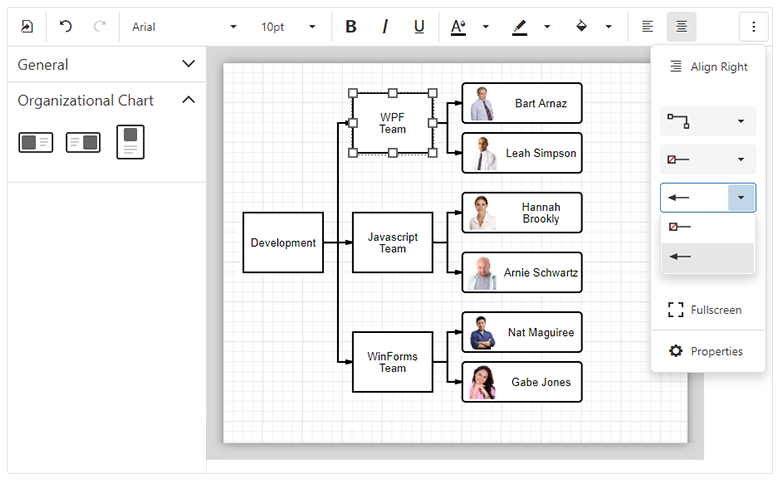
1. Web Diagram (available in 19.2 Early Access Preview)

Availability

In this Early Access Preview, the DevExpress Web Diagram component will only be available as a DevExtreme widget. We will ship ASP.NET Core, ASP.NET WebForms and ASP.NET MVC versions of our web Diagram component once v19.2 is released officially.

Diagram for ASP.NET Core, WebForms and MVC

Shape Containers

New shape types - horizontal and vertical containers - allow you to combine other shapes within a "container". Our Web Diagram component supports stacked containers and ships with expand and collapse functionality.

Images in Shapes

You can now associate a predefined (or custom) image with new image shapes via a database or the widget’s UI. The image will maintain the shape's size and its position when the shape is moved or resized.

New Data Binding Capabilities

We implemented advanced data binding for shape settings. You can bind all shape properties including shape and connectors style, shape image URL, position, and size to a database. We expect to support data binding for all new shape settings.

Full Screen Mode

Our Diagram now supports fullscreen mode. You can add a corresponding toolbar command or use the fullscreen property to enable Fullscreen mode within your web app.

Read Only Mode

Read only mode protects the Diagram from edit operations. Use the readOnly property to enable this diagram option.

Simple View

When you activate our new Simple View mode, the Web Diagram removes gray document borders and the diagram’s content fully occupies available screen real-estate.

Zooming Document Content

DevExpress Web Diagram can now apply zoom levels to its content. To change zoom level, use the 'Zoom Level' editor on the Properties panel or CTRL+Mouse Scroll combination. Select the 'Auto Zoom' check box to auto zoom the diagram to fit the page.

UI Customization

Web Diagram provides new APIs to control the visibility and the content of the following UI elements:

To learn more and explore the features described herein, please see our online Web Diagram demo.

2. Web Gantt

Availability

We expect to ship a Gantt component for ASP.NET Core, ASP.NET WebForms and ASP.NET MVC in an upcoming build. Please stay tuned to this website for more information on our ASP.NET Gantt control.

DevExpress Web Gantt

Node Editing

The following edit actions will be available:

  • Resize and modify tasks
  • Change dependencies between tasks
  • Edit cell values within the Tree List region. The component immediately saves changes on the server and updates the Gantt chart when cell values change.

Change History

Our Gantt stores changes made by an end-user. Changes may be rolled back when necessary.

Task Selection API

DevExpress Gantt ships with a comprehensive API and a customizable UI to control the task selection process.

Region Resizing

End users can resize both Gantt and Tree List regions as needed (via the control’s built-in separator bar).

Real-time Scaling

DevExpress Gantt allows you to browse data across various levels of detail. Hold the CTRL key and rotate your mouse’s scroll wheel to zoom (in or out).

3. ASP.NET WebForms and MVC Extensions

3.1 Pivot Grid

Aggregation at Any Level

This release includes an optimized WinForms Pivot Grid calculation engine. This new engine provides a more versatile summary expression function. The scope of the function is unbound fields. The Aggr function aggregates data with a specific summary function against a specific set of dimensions. Aggr functions can be nested as needed (you can easily create the desired aggregation level within the control).

DevExpress ASP.NET PivotGrid

The Aggr function has the following syntax:

Aggr(summaryExpression, dimension1, dimension2, ...)

The first argument is a summary expression calculated against a data source field. It is followed by a set of dimensions whose values are grouped to calculate summaries for the first argument.

Aggregation at Any Level thread on Support Center
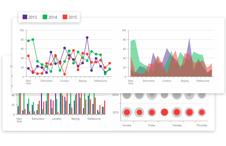
3.2 Charts

3.2.1 TimeSpan Axis Scale Support

v19.2 will ship with full support for TimeSpan scales. You can plot your TimeSpan data as-is or specify a custom aggregation mode. TimeSpan data can be mapped to an X-Axis, Y-Axis or both.

DevExpress ASP.NET Charts - TimeSpan Axis

3.2.2 Waterfall Series

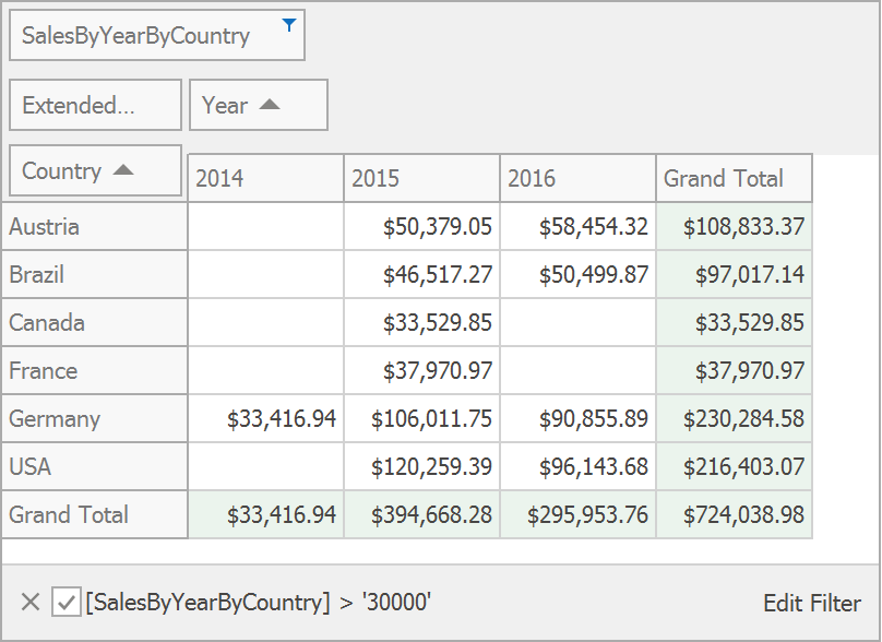
Waterfall charts display the manner in which initial values are affected by a series of intermediate positive or negative values. You can plot Waterfall charts based on relative or absolute data values. We have also implemented two summary types: Total bar summarizes all values and is always positioned on the right side of the chart's diagram; Subtotals can be defined between two adjacent points (bars) to display intermediate values.

DevExpress ASP.NET Charts - Waterfall

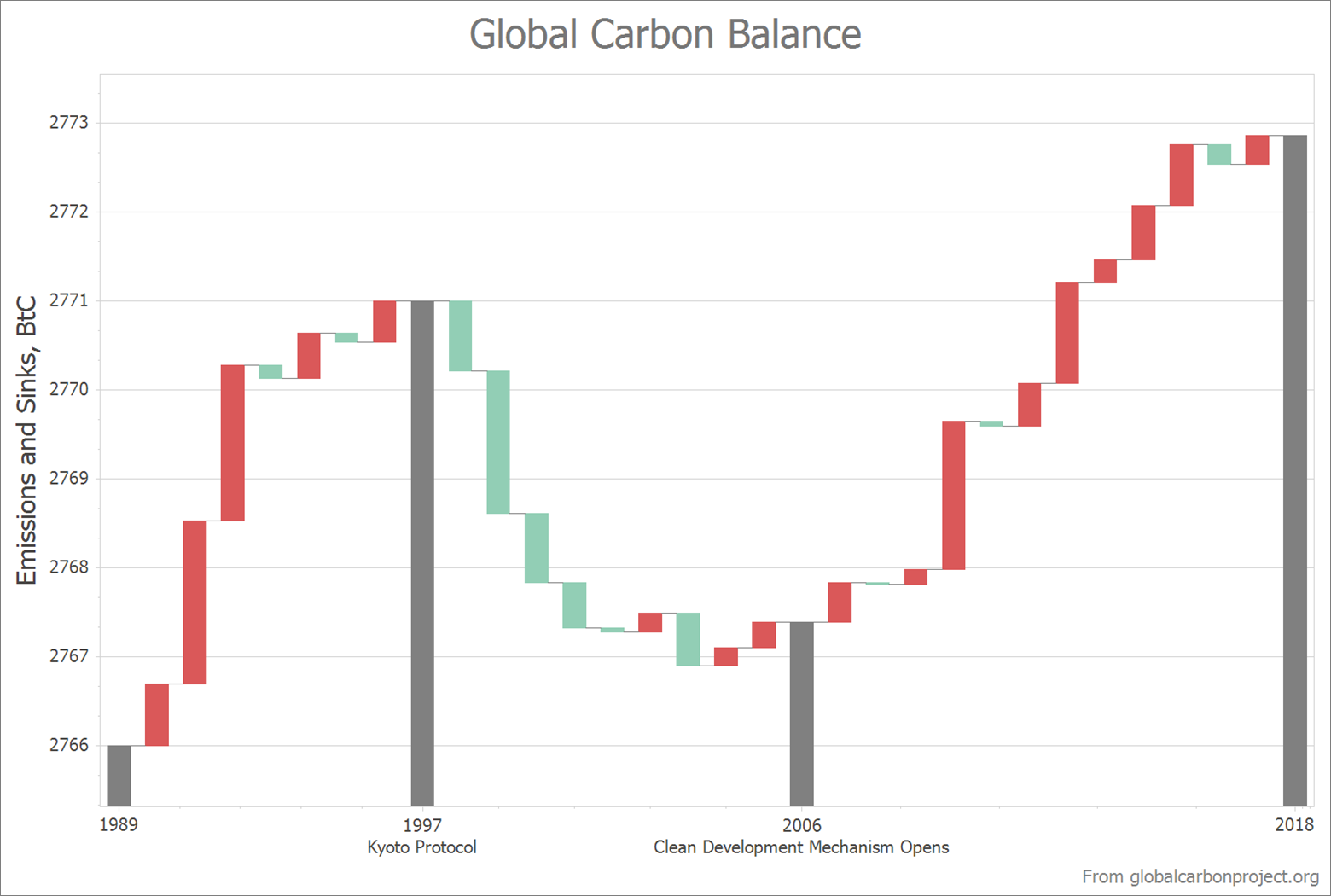
3.2.3 Box Plot Series

The Box Plot chart is a simple way to analyze statistic-driven data points. To draw a Box Plot point, you must specify Min, Quartile1, Median, Quartile3 and Max parameters. You can optionally display a set of Outliers and a Mean value.

Note: This early access release only includes our WinForms implementation. This features will be added to both our ChartControl for WPF and WebChartControl for ASP.NET prior to official release.

DevExpress ASP.NET Charts - Box Plot

4. DevExtreme-Based ASP.NET Controls

4.1. Form Scaffolding Wizard

We added Form to the list of controls supported by our Visual Studio scaffolding wizard. You can now quickly generate forms based on model classes.

DevExtreme ASP.NET Form Wizard

We also added support for two useful data annotations: [Display(Prompt)] and [Display(Description)]. Values are automatically picked up at runtime to populate Placeholder for editors and HelpText for form items.

4.2. 'Add DevExtreme to the Project' Command Compatible with ASP.NET Core 3.0

Recently, we announced ASP.NET Core 3 compatibility of our DevExtreme-based ASP.NET Core controls. We have also checked and updated our Visual Studio 'Add DevExtreme to the Project' command to make certain that it works as expected with Endpoint routing and the new JSON serialization introduced in ASP.NET Core 3. Though, we have yet to provide project templates for ASP.NET Core 3, you can use this tool to integrate DevExtreme-based controls into an existing ASP.NET Core 3 project (using Visual Studio 2019 Preview).

4.3. Async Support in DevExtreme.AspNet.Data

This release includes async support (preview) within the DevExtreme.AspNet.Data library (used for data binding).

Once officially released, we will update our API Controller Scaffolding to generate asynchronous code. In the interim, you can update your NuGet package to 2.5.0-rc1 and try the new DataSourceLoader.LoadAsync method to take advantage of this feature (async capabilities provided by Entity Framework Core, Entity Framework 6, NHibernate, and XPO).

Refer to GitHub release notes for details and code samples.

4.4. ASP.NET Core File Manager

DevExpress File Manager for ASP.NET Core and ASP.NET MVC is not included in this Early Access Preview but will be added to an upcoming build. Key features will include:

4.4.1. Data Binding

ASP.NET Core File Manager will retrieve data from a database and generate a UI automatically.

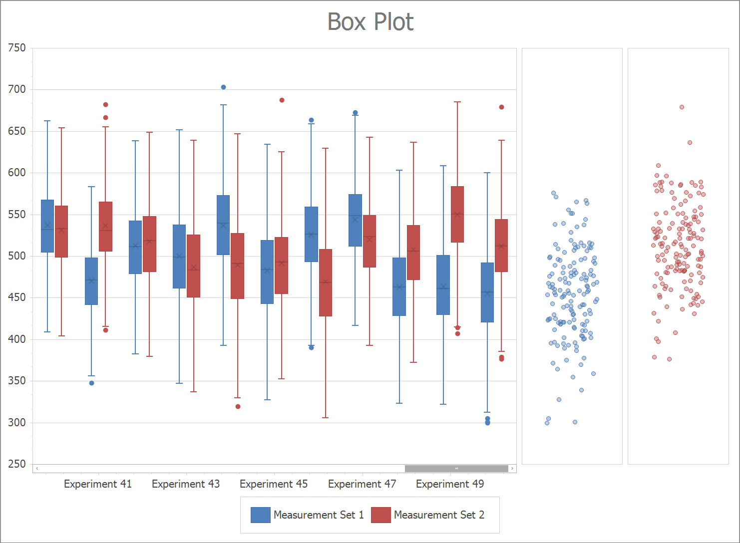
4.4.2. Progress and Status UI

The DevExtreme-based ASP.NET File Manager provides new UI elements to track file operation progress in real time:

  • A notification popup appears when a file operation starts, finishes or fails.
  • The progress side panel displays operation status.
  • The ‘Refresh’ toolbar item includes text and an icon to reflect the status of your current operation.

DevExtreme ASP.NET Core File Manager

5. Reporting

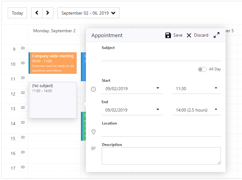
5.1 In-Place Rich Text Editing

Our XRRichText control allows end-users to edit its content. Double click the control to activate the editor:

Rich Text In-Place Editing

Tell Us What You Think

Please explore the following online demo to learn more about this feature: Web Report Designer - In-Place Rich Text Editing. The _Data -> Load File _properties panel editor allows you to load your file (HTML, DOCX and RTF) and check how its rendered within the editor (or within the print preview).

We are eagerly waiting for your feedback, so cast your vote to the survey below:

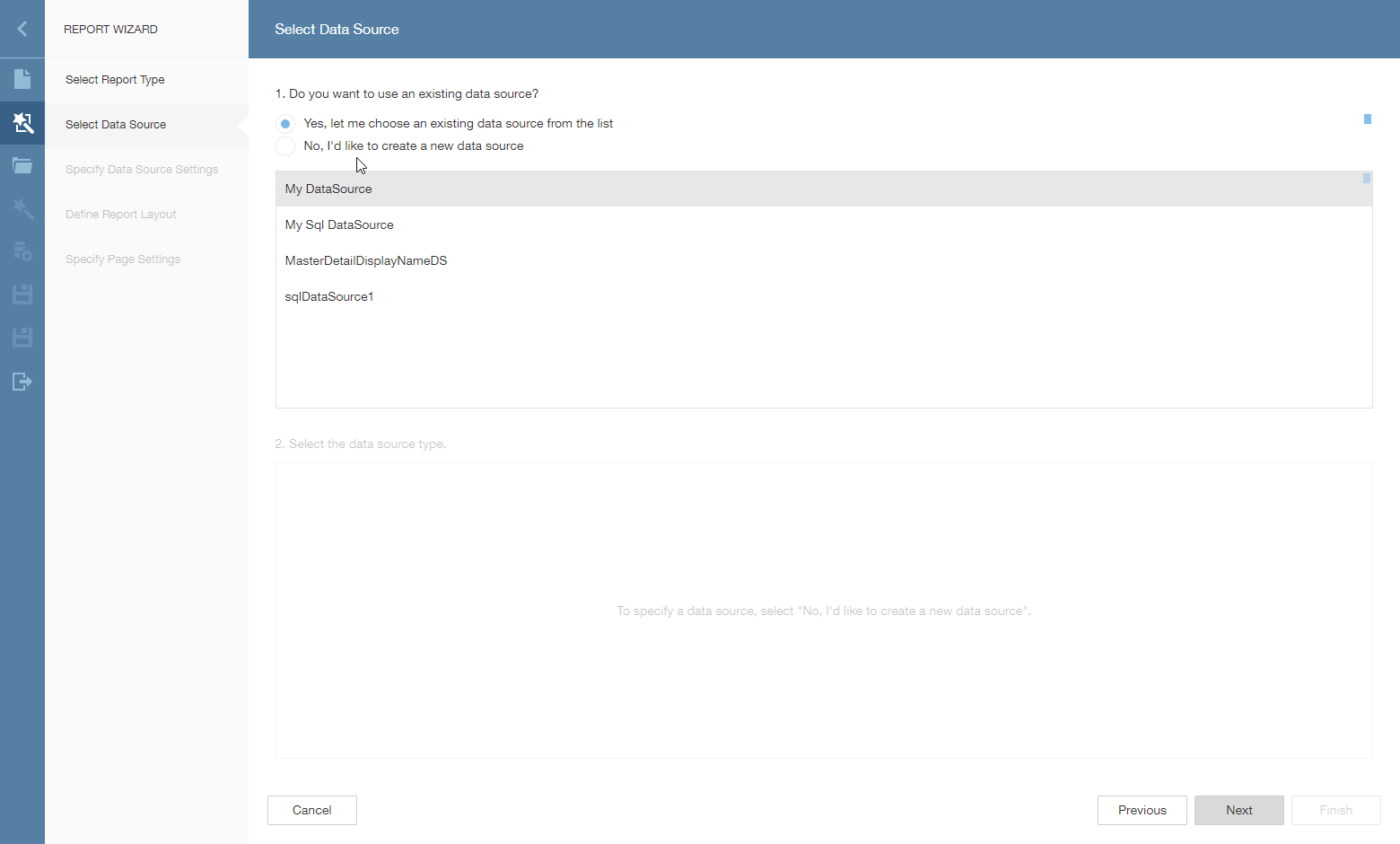
5.2 Bind a Report to ObjectDataSource Using the Data Source Wizard

You can use this data source type in the Data Source Wizard to bind a report to a collection of business objects.

Bind a Report to Object Data Source in Web Report Designer

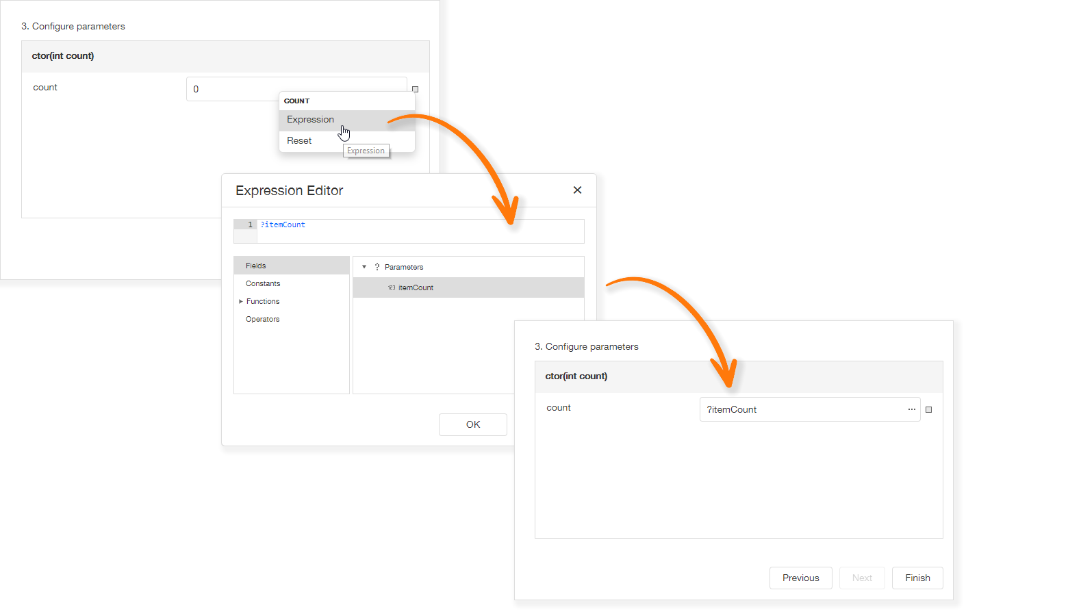
The data source wizard allows you to specify the parameter expression (using the Expression Editor) and pass an existing report parameter to the constructor or a method that returns a collection of business objects:

Specify Object Data Source Parameters

Tell Us What You Think

Please explore the following online demo to learn more about this feature: Web Report Designer - Object Data Source Wizard.

If you’d like to check how the wizard works with your own data access layer, you should:

  • Backup your application and then upgrade it to v19.2;
  • Implement the DevExpress.DataAccess.Web.IObjectDataSourceWizardTypeProvider interface:
public class ObjectDataSourceWizardTypeProvider : IObjectDataSourceWizardTypeProvider {
        public IEnumerable<Type> GetAvailableTypes(string context) {
                return new [] { typeof(MyBusinessObjectType) };
        }
    }
  • Register your implementation at the application startup:
DefaultReportDesignerContainer.RegisterObjectDataSourceWizardTypeProvider<ObjectDataSourceWizardTypeProvider>();

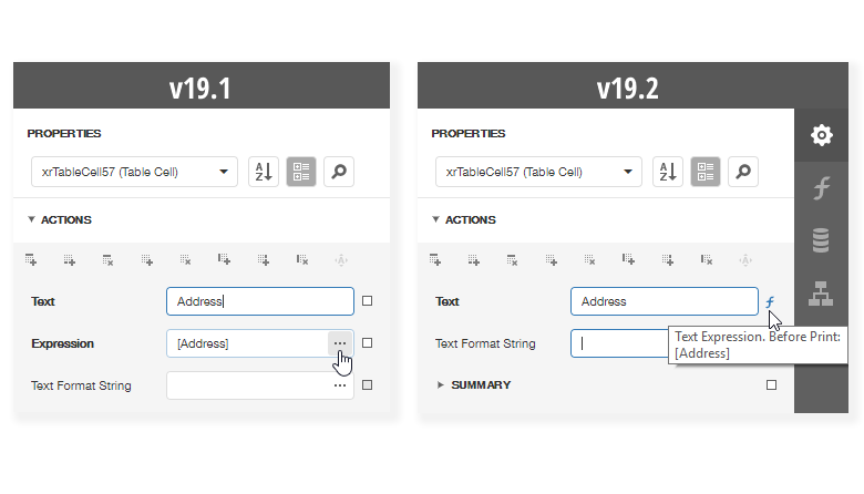
5.3 Properties Panel Update

In previous versions, two editors were used for a single property: the first was created to specify a static value and the second to provide an expression. We updated the properties panel to make it more compact and eliminate the confusion related to the use of two editors for a single property:

Properties Panel - Comparison

This enhancement helps bring the Web Report Designer closer to its WinForms counterpart. Previously a square icon could be used to reset a property to its default value. With this update, the icon near each property also indicates whether a property value differs from its default value, and allows you to define an expression as needed. Property editor values that were specified via an expression now display a formula icon to the right of the editor.

6. Office File API

6.1 Word Processing – Hyphenation

Our Word Processing Document API now supports soft hyphens and automatic hyphenation. You can load, print and export documents with soft hyphens.

Link a dictionary that specifies hyphenation rules to enable automatic hyphenation. Please refer to thehyphenation-simple-example repository for a sample project.

Once you provide hyphenation dictionaries, you can enable or suppress automatic hyphenation in code.

6.2 Excel Binary Workbook (XLSB) Support

The Spreadsheet Document API now supports the XLSB (BIFF12) format. Give it a try and load and save your documents using this format.

Note: the Early Access Preview build has the following limitations:

  • Encryption is not supported for XLSB documents;
  • Slicers will be stripped from your binary files.

6.3 PDF Document API – Custom Properties

The PDF Document API allows you to manage a document’s custom property collection. Use PdfDocument.CustomProperties to access the collection. You can add and delete custom properties or change associated names or values.

Please check the pdf-document-api-custom-properties repository for a sample project.

// Add new property
document.CustomProperties.Add("NumberOfCopies", "3");

// Modify the CompanyEmail property value:
if (document.CustomProperties.ContainsKey("CompanyEmail"))
    document.CustomProperties["CompanyEmail"] = "clientservices@devexpress.com";

// Remove the HasImages property:
document.CustomProperties.Remove("HasImages");

Get Started Today

If you own an active Universal or DXperience subscription, you can download our Early Access Preview build via the DevExpress Download Manager.

As always, your feedback will help us deliver the best possible build. Should you have questions about these new features, or should you experience technical issues during the Early Access Preview, please contact us via the DevExpress Support Center or the comment section below.

If you are using a trial version and would like to access these new features today, purchase a Universal or DXperience subscription license and you will automatically receive access to the Early Access Preview version. If you are ready to upgrade to Universal or DXperience from another subscription level, email us at clientservices@devexpress.com for preferential upgrade pricing.

**NOTE:** Early Access and CTP builds are provided solely for early testing purposes and are not ready for production use. This build can be installed side by side with other major versions of DevExpress products. Please backup your project and other important data before installing Early Access and CTP builds.

Blazor Components - Free Anchor Navigation Tool

$
0
0

As you may know, Blazor does not currently support navigation via anchors. In addition, Blazor does not support hyperlinks that only include anchor IDs within the href attribute (<a href=”#MyAnchor1”>some text</a>). To help address these limitations, we created a free navigation tool for both client-side and server-side Blazor projects.

Currently, the Blazor framework does not support in-page navigation using anchors or skip links. To solve this limitation, we have created a free tool to help you with in-page navigation in your Blazor websites. The tool, similar to our MetaData tool, is free and works both in Blazor client-side and server-side projects.

Features and Capabilities

The DevExpress Anchor Navigation tool automatically scrolls a page to an anchor in the following instances:

  • When an end-user clicks a hyperlink with an anchor;
  • When a page is first opened and contains an anchor ID within its URL (for instance, https://demos.devexpress.com/blazor/SchedulerViewTypes#DayView).

Our tool also includes a Blazor AnchorLink component. Use this component to create in-page navigation links as needed:

<AnchorLink class="nav-link py-3 px-4" href="#MySection1">My Section 1</AnchorLink><AnchorLink class="nav-link py-3 px-4" href="#MySection2">My Section 2</AnchorLink>

When an end-user clicks the link, the page scrolls to the corresponding anchor:

<h2 id="MySection1">Section 1</h2><p>Lorem ipsum dolor sit amet...</p><h2 id="MySection2">Section 2</h2><p>Quisque imperdiet risus quis nisl vulputate...</p>

Integrating the Anchor Navigation Tool

Full source code for our Blazor Anchor Navigation tool is available on GitHub. Please follow the instructions below to include it within your next Blazor project.

  1. Download the DevExpress.Blazor.AnchorUtils project and add it to your Blazor solution.
  2. Add the DevExpress.Blazor.AnchorUtils namespace to _Imports.razor:

@using DevExpress.Blazor.AnchorUtils

  1. Add AnchorUtilsComponent to Shared/MainLayout.razor file:
<div>
    ...<div class="content px-4">
          @Body</div></div><AnchorUtilsComponent />
  1. Find the JavaScript wwwroot/anchor-utils.js file in the anchor navigation source code. Copy this file to the wwwroot folder or to its subfolders.
  • For server-side Blazor: register this file in Pages/_Host.cshtml of your project.
  • For client-side Blazor: register this file in wwwroot/index.html of your project.

<script type="text/javascript" src="~/anchor-utils.js"></script>

  1. (optional) If your page layout contains a pinned (non-scrollable) header (like the standard Blazor project), edit the anchor-utils.js file and update the following code to obtain vertical scroll offset appropriate for your application:

y -= document.querySelector(".main .top-row").offsetHeight;

Note: If a client-side Blazor application is deployed as a set of static files, the web server provides the index.html file by a root URL (e.g., https://mywebsite.com/) only. If a browser requests a specific page by its direct URL (e.g., https://mywebsite.com/MyPage1), the web server raises a 404-code exception. Refer to the Getting 404 on pages other than root when Blazor hosted in IIS to learn more about this issue and a possible solution. The solution requires URL Rewrite Module.

How it works

First, we need to obtain an anchor from the current URI (if it exists). We’ll use the IUriHelperOnLocationChanged event event to do so:

@inject IUriHelper UriHelper
...
@code {
    string Anchor { get; set; }
    bool ForceScroll { get; set; } 
    protected override void OnInitialized()
    {
        base.OnInitialized();
        ForceScroll = true;
        UriHelper.OnLocationChanged += OnLocationChanged;
    } 
    void OnLocationChanged(object sender, LocationChangedEventArgs args)
    {
        var anchor = UriHelper.ToAbsoluteUri(args.Location).Fragment;
        ...
    } 
}

The ScrollToAnchor C# method invokes the scrollToAnchor JavaScript function and sends an anchor ID as a parameter:

...
@inject IJSRuntime JSRuntime
@inject IComponentContext ComponentContext
...
    bool ScrollToAnchor(string anchor)
    {
        if (ComponentContext.IsConnected && (!string.IsNullOrEmpty(anchor) || ForceScroll))
        {
            JSRuntime.InvokeAsync<string>("scrollToAnchor", anchor);
            return true;
        }
        return false;
    }

We’ll call the ScrollToAnchor method in the OnLocationChanged event handler to scroll the page when navigation location changes. We’ll also call the method in the OnAfterRenderAsync event handler to initiate scrolling (if necessary) when a page first loads:

protected override Task OnAfterRenderAsync()
    {
        ScrollToAnchor(Anchor);
        if (ForceScroll)
        {
            ForceScroll = false;
        }
        return base.OnAfterRenderAsync();
    } 
    void OnLocationChanged(object sender, LocationChangedEventArgs args)
    {
        var anchor = UriHelper.ToAbsoluteUri(args.Location).Fragment;
        if (!ScrollToAnchor(anchor))
        {
            Anchor = anchor;
        }
    }

The scrollToAnchor JavaScript function scrolls to the required anchor element.

Javascript:

function scrollToAnchor(anchor) {
    var selector = anchor || document.location.hash;
    if (selector && selector.length > 1)
    {
        var element = document.querySelector(selector);
        if (element)
        {
            var y = element.getBoundingClientRect().top + window.pageYOffset;
            /* The following code updates the vertical scroll bar's offset for a standard Blazor Visual Studio template.
               Update the code to get an offset that is suitable for your application.  */
            y -= document.querySelector(".main .top-row").offsetHeight
            window.scroll(0, y);
        }
    }
    else
    {
        window.scroll(0, 0);
    }
}

Feedback

As always, your feedback matters. Do you plan on using anchors in your Blazor applications? Post your comments below and share your Blazor-related development experiences with us.

Blazor Components - DataGrid and Scheduler Enhancements (available in Beta #3)

$
0
0

The third Beta of the DevExpress UI for Blazor is now available. This update includes a series of enhancements for both our Blazor Data Grid and Scheduler component (see below). It also includes support for Blazor Preview 9 and updates to our online documentation.

Blazor Preview 9 Support

Last week, Microsoft announced the release of .NET Core 3.0 Preview 9. Our Blazor components fully support Preview 9 with our Beta 3 release.

Data Grid

We've added four major features to our Blazor Data Grid:

Column Reorder

You can now drag a column header and reposition it to change column order. Two arrows indicate valid drop positions.

DevExpress Blazor Grid - Column Reorder

Note: The edit form displays editors in the same order as columns in the grid. You can use the EditFormVisibleIndex property to arrange editors in the edit form as needed.

Column Groups

Enable the Group Panel within the Blazor Data Grid to allow end-users to group data by individual columns.

<DxDataGrid … ShowGroupPanel="true">
Note: Group panel column order is of consequence whenever you group data against multiple columns. The grid groups data by column values sequentially (starting from the leftmost column in the group panel).

DevExpress Blazor Grid - Column Groups

Column order in the group panel matters when you group data by several columns. The grid groups data by each column one by one (starting from the left).

To exclude a column from grouping, set its AllowGroup property to false.

<DxDataGridColumn AllowGroup="false"></DxDataGridColumn>

To group data in code, specify the column's GroupIndex property to define its grouping priority. The lower the value, the higher a column's priority in grouping. In the following example, our Blazor Data Grid first groups data by a column with GroupIndex = 0 and then - by a column with GroupIndex = 1.

<DxDataGridComboBoxColumn GroupIndex="0"></DxDataGridComboBoxColumn><DxDataGridColumn GroupIndex="1"></DxDataGridColumn>

To see this feature in action, please refer to our Data Grid online demo.

By default, grouped column data is not displayed. Set the ShowGroupedColumns property to true to display data.

Master-Detail Layout

Our Blazor Data Grid allows you to build master-detail layouts ( DetailRowTemplate ) of any complexity and depth. Our template implementation is not limited and allows you to address a broad range of usage scenarios..

To see our master-detail implementation in action, please review our online Master-Detail View demo. The template used within this demo contains a detailed Data Grid inside a plain HTML.

Multiple Row Selection

To select multiple rows in the DevExpress Blazor Data Grid, click a row, a command checkbox (if shown), or use our Data Grid API. The SelectionMode property allows you to specify selection mode:

  • Single Selection (default behavior) - Only one data row can be selected at any one time. See our Single Data Row Selection online demo.

  • Multiple Selection - Multiple data rows can be selected at any one time. See our Multiple Data Rows Selection online demo.

  • Optimized Multiple Selection - In this mode, the component does not store row data objects and information about all selected rows - The grid maintains row key values instead (make sure the KeyFieldName property is initialized). If you select all rows via the Grid’s UI or its API and then unselect multiple rows, the component only stores unselected row keys (and vice versa). This reduces the amount of stored data. We recommend you use this mode if your Blazor Grid contains a significant number of rows. See our online demo for more information.

  • None - Row selection is disabled.

Scheduler

Appointment Editing

DevExpress Scheduler for Blazor now includes a popup edit form to edit appointment data. The default edit form only displays primary data input fields (it hides others). Click the "Expand Form" button in the top-right corner to display all available fields.

DevExpress Blazor Scheduler

To create a new appointment quickly, select a time range in the Scheduler. The Scheduler component displays an appointment within the view and automatically invokes the edit form:

DevExpress Blazor Scheduler

Drag-And-Drop and Resize Appointments

Though you can change appointment time range within the Edit Form, our Blazor Scheduler component allows you to reschedule the appointment via drag & Drop (drag the appointment to a new time cell within the current view or resize the appointment to change the current time range):

DevExpress Blazor Scheduler

Tooltip

Click or tap on an appointment to view its full description. In addition, the Scheduler displays a tooltip with detailed appointment information:

DevExpress Blazor Scheduler

Note: At present, all Scheduler features described herein are enabled by default. We will give you the ability to customize and disable these features in future versions.

Documentation

I am happy to announce that our online Blazor documentation is now available.

Feedback

Your feedback matters and I would love to hear how you plan to use these new features in your next Blazor application.

ASP.NET and MVC PDF Printing - Issue with Google Chrome 77.0.3865.75

$
0
0

We've discovered that PDF printing is broken in the recent Chrome 77.0.3865.75 update. This version of the Chrome browser does not display or print PDF documents which are displayed in an IFrame.

Affected components

ASP.NET WebForms:

  • ASPxDocumentViewer
  • ASPxRichEdit
  • ASPxSpreadsheet
  • BootstrapRichEdit
  • BootstrapSpreadsheet

ASP.NET MVC Extensions:

  • DocumentViewer
  • RichEdit
  • Spreadsheet

ASP.NET Core

  • Spreadsheet

We are working on this issue, and we expect to address it soon. Please add the following tickets to your Support Center favorites to be notified of a hotfix when available:

Solutions

If you cannot wait for a hotfix, please use the following code to resolve this issue (this code will also work for old versions of our products).

Document Viewer Solution

  1. Handle the client-side Init event in the ASPxDocumentViewer or DocumentViewer MVC Extension :

[WebForms]

<dx:ASPxDocumentViewer ID="ASPxDocumentViewer1" runat="server" ... ><ClientSideEvents Init="onDocumetnViewerInit" />
       ...</dx:ASPxDocumentViewer>

[MVC]

@Html.DevExpress().DocumentViewer(settings =>(
    settings.Name="MyDocumentViewer";
    settings.ClientSideEvents.Init="onDocumetnViewerInit";
    ...
  )
).GetHtml();
  1. Implement the following JavaScript Init function in the <head> or <body> or tags of your web page:
function onDocumetnViewerInit (s) {
    var createFrameElement = s.viewer.printHelper.createFrameElement;
    s.viewer.printHelper.createFrameElement = function (name) {
        var frameElement = createFrameElement.call(this, name);
        if(ASPx.Browser.Chrome) {
            frameElement.addEventListener("load", function (e) {
                if (frameElement.contentDocument.contentType !== "text/html")
                    frameElement.contentWindow.print();
            });
        }
        return frameElement;
    }
}

RichEdit Solution

  1. Handle the client-side Init event, ASPxRichEdit , BootstrapRichEdit or RichEdit MVC Extension :

[WebForms]

<dx:ASPxRichEdit ID="ASPxRichEdit1" runat="server" ... ><ClientSideEvents Init="onRichEditInit" />
        ...</dx:ASPxRichEdit>

[Bootstrap]

<dx:BootstrapRichEdit ID="ASPxRichEdit1" runat="server" ... ><ClientSideEvents Init="onRichEditInit" />
        ...</dx:BootstrapRichEdit>

[MVC]

@Html.DevExpress().RichEdit(settings =>(
    settings.Name="MyRichEdit";
    settings.ClientSideEvents.Init="onRichEditInit";
    ...
  )
).GetHtml();
  1. Implement the following JavaScript onRichEditInit function in the <head> or <body> or tags of your web page:
function onRichEditInit(s) {
  if (ASPx.Browser.Chrome && ASPx.Browser.Version >= 77) {
    var createHelperFrame = s.createHelperFrame;
    s.createHelperFrame = function () {
      var helperFrame = createHelperFrame.call(this);
      helperFrame.frameElement.addEventListener("load", function () {
        if (helperFrame.frameElement.contentDocument.contentType === "application/pdf")
          helperFrame.frameElement.contentWindow.print();
      });
      return helperFrame;
    }
  }
}

Spreadsheet Solution

  1. Handle the client-side Init event in the ASPxSpreadsheet , ASP.NET Core Spreadsheet, BootstrapSpreadsheet and Spreadsheet MVC Extension:

[WebForms]

<dx:ASPxSpreadsheet ID="ASPxSpreadsheet1" runat="server" ... ><ClientSideEvents Init="onSpreadsheetInit" />
        ...</dx:ASPxSpreadsheet>

[ASP.NET Core]

@(Html.DevExpress()
    .Spreadsheet("spreadsheet")
    .ClientSideEvents(events => {
        events.OnInit("onSpreadsheetInit");
     })
    ...
)

[Bootstrap]

<dx:BootstrapSpreadsheet ID="BootstrapSpreadsheet1" runat="server" ... ><ClientSideEvents Init="onSpreadsheetInit" />
        ...</dx:BootstrapSpreadsheet>

[MVC]

@Html.DevExpress().Spreadsheet(settings =>(
    settings.Name="MySpreadsheet";
    settings.ClientSideEvents.Init="onSpreadsheetInit";
    ...
  )
).GetHtml();
  1. Implement the following JavaScript onSpreadsheetInit function in the <head> or <body> or tags of your web page:
Note: we provide two workarounds for different versions of Spreadsheet. Make sure you implement an appropriate workaround in your web application.

[v18.1+]

function onSpreadsheetInit(s, e) {
    if(ASPx.Browser.Chrome && ASPx.Browser.Version >= 77) {
        var createSupportFrameElement = s.getRenderHelper().createSupportFrameElement;
        s.getRenderHelper().createSupportFrameElement = function() {
            var printFrame = createSupportFrameElement.call(this);
            var printFrameElement = document.getElementById(printFrame.name);
            printFrameElement.addEventListener("load", function(e) {
                if(printFrameElement.contentDocument.contentType === "application/pdf")
                    printFrameElement.contentWindow.print();
            });
            return printFrame;
        }
    }
}

[v16.2 – v17.2]

function onSpreadsheetInit(s, e) {
    if(ASPx.Browser.Chrome && ASPx.Browser.Version >= 77) {
        var createSupportFrameElement = s.getRenderProvider().createSupportFrameElement;
        s.getRenderProvider().createSupportFrameElement = function() {
            var printFrame = createSupportFrameElement.call(this);
            var printFrameElement = document.getElementById(printFrame.name);
            printFrameElement.addEventListener("load", function(e) {
                if(printFrameElement.contentDocument.contentType === "application/pdf")
                    printFrameElement.contentWindow.print();
            });
            return printFrame;
        }
    }
}

Please contact our support team if you need any assistance with this issue or the solutions above.

Blazor - Official Release, Free Offer, and Future Plans

$
0
0

I'm happy to announce the official release of DevExpress UI for Blazor. To help celebrate Blazor official launch at #dotnetconf, we're offering our this release to our customers free-of-charge!

Download

Version 19.1.7 is available on the DevExpress NuGet server. Find your personal NuGet feed URL in Download Manager and setup Visual Studio's NuGet Packeage Manager to proceed with installation.

What's Included

Our initial release includes 12 native Blazor UI controls:

Data Grid

DevExpress Blazor DataGrid

Main features:

  • Data binding, including bind to a large data source.
  • Different column types to display and edit text, numbers, dates, and Boolean values.
  • Built-in Edit Form.
  • Sorting data by single or several columns.
  • Data grouping.
  • Filter column values by 'Starts With' condition.
  • Paging.
  • Templates.
  • Single and multiple row selection.
  • Virtual Scrolling

See our Blazor Data Grid online demo and documentation for more information.

Pivot Grid

DevExpress Blazor PivotGrid

Main features:

See our Blazor Pivot Grid online demo and documentation for more information.

Scheduler

DevExpress Blazor Scheduler

Main Features

  • Binding to a data source
  • Day, Week and Work Week views.
  • Appointment CRUD operations.
  • Drag-and-drop appointments support

See our Blazor Scheduler online demo and documentation for more information.

Charts

DevExpress Blazor Charts

DevExpress Charts for Blazor includes Ten chart series:

  • Line
  • Area
  • Bar
  • Bubble
  • Range Bar
  • Range Area
  • Candlestick
  • Stock
  • Pie
  • Donut

Our Blazor Chart controls also support multiple series, series tooltip customization and a legend. See our Blazor Chart control online demo and documentation for more information.

Data Editors

DevExpress Blazor Data Editors

DevExpress provides 6 native Editors for Blazor:

  • Calendar
  • ComboBox
  • Date Edit
  • List Box
  • Spin Edit
  • Text Box

In addition, DevEpxress Blazor editors support the default Blazor EditForm component that enables model data validation.

See our Blazor Data Editors online demo and documentation for more information.

Navigation and Layout

DevExpress Blazor Navigation and Layout

DevExpress navigation and layout control set provides you with the following capabilities:

  • You can create adaptive layout on your page with Blazor FormLayout
  • Implement custom data paging using DevExpress Pager for Blazor
  • Use the Popup component popup to add popup dialogs to your Blazor application page.
  • Build tabbed layout on a web page with the Blazor Tabs component .
  • Add TreeView to your Blazor web pages to display hierarchical data or implement numerous navigation scenarios.

See our Blazor Navigation and Layout online demo and documentation for more information.

Source Code

Source code is available only for active DXperience and Universal subscribers.

Licensing

The DevExpress UI for Blazor will be part of the DevExpress ASP.NET Subscription. If you own an active ASP.NET, DXperience or Universal Subscription, all DevExpress Blazor products will be made available to you automatically. If you are a new to DevExpress or if your subscription has lapsed, you can download our first release free-of-charge.

Plans

This release is our first milestone. Here’s what you can expect in the future releases:

  • Various Data Grid Enhancements.
  • Data Editors enhancements.
  • Localization support.
  • New native Blazor components (we will announce plans in our 2020 roadmap).
Viewing all 372 articles
Browse latest View live