The newest version of DevExpress UI for Blazor (v19.1.8) is now available. This update includes key enhancements for the following DevExpress Blazor components: Data Grid, Charts, TreeView and Tabs.
Data Grid
New Data Paging API
Our Blazor Data Grid component ships with an external data navigation API. Activate the grid’s paging mode (DataNavigationMode = DataGridNavigationMode.Paging) and use the following API to enable paging:
PageIndex- Specifies the current page index.PageIndexChanged- Fires when the current page index is changed.PageCount- Returns the current page count.PageCountChanged- Fires when the current page count is changed.
To synchronize paging, link the grid’s API with an external navigation component using the @bind- directive:
<DxPager @bind-ActivePageIndex="@GridPageIndex" PageCount="@GridPageCount"></DxPager><DxSpinEdit @bind-Value="@GridPageNumber" MinValue="1" MaxValue="@GridPageCount"></DxSpinEdit><DxDataGrid ...
    @bind-PageIndex="@GridPageIndex"
    @bind-PageCount="@GridPageCount"
    ...>
...</DxDataGrid>
@code {
    int gridPageIndex;
    [Parameter] public int GridPageIndex {
        get => gridPageIndex;
        set { gridPageIndex = value; InvokeAsync(StateHasChanged); }
    }
    [Parameter] public int GridPageNumber {
        get => gridPageIndex + 1;
        set { gridPageIndex = value - 1; InvokeAsync(StateHasChanged); }
    }
    int gridPageCount;
    [Parameter] public int GridPageCount {
        get => gridPageCount;
        set { gridPageCount = value; InvokeAsync(StateHasChanged); }
    }
}
TreeView
Node Template Support
Our Blazor TreeView allows users to create reusable layouts for both nodes and associated content via templated UI elements. Available templates are listed below:
NodeTemplate- Specifies a template for all TreeView node content. The template is the same for all nodes.NodeTextTemplate- Specifies a template for all TreeView node text. The template is the same for all nodes.Template- Specifies a template for an individual node's content.TextTemplate- Specifies a template for an individual node's text.
To learn more, please review our TreeView templates demo.
New Node Expand/Collapse Actions
You can now specify which user action expands or collapses a node. To enable this feature, set the NodeExpandCollapseAction property to one of the following actions:
Auto– Click (or double-click if the AllowNodeSelection property is set to “true”) a node or its expand button to expand/collapse the node.NodeClick- Click a node or its expand button to expand or collapse the node.NodeDoubleClick- Double click a node or its expand button to expand or collapse the node.ButtonClick– Only click a node’s expand button to expand or collapse the node.
<DxTreeView @ref="@treeView"
    AllowSelectNodes="true"
    NodeExpandCollapseAction="TreeViewNodeExpandCollapseAction.NodeClick"
    ...><NodeTemplate><h4 class="d-inline-block m-0 @GetNodeCssClass(context)">@context.Text</h4></NodeTemplate>
    ...</DxTreeView>
@code {
    DxTreeView treeView;
    protected string GetNodeCssClass(ITreeViewNodeInfo nodeInfo) {
        var selectedNode = treeView.GetSelectedNodeInfo();
        var selectedStateClass = selectedNode != null &&
            selectedNode.Name == nodeInfo.Name ? "text-primary" : "text-secondary";
        var expandedStateClass = !nodeInfo.IsLeaf &&
            treeView.GetNodeExpanded(n => n.Name == nodeInfo.Name) ?"font-weight-bold" : "";
        return (selectedStateClass + " " + expandedStateClass).Trim();
    }
}
Event Source Detecting
We’ve extended the functionality of TreeViewNodeEventArgs. You can now use the TreeViewNodeEventArgs.CausedByAPI event argument to detect whether an event was raised through end-user interaction or programmatically.
<DxTreeView @ref="@treeView"
    BeforeExpand="@BeforeExpand" ...>
    ...</DxTreeView>
@code {
    protected void BeforeExpand(TreeViewNodeCancelEventArgs e)
    {
        if (!e.CausedByAPI)
            treeView.CollapseAll();
    }
}
Node API
The new GetNodesInfo method provides information about required nodes. We’ve also extended the ITreeViewNodeInfo interface to include a property option that contains information about a node’s parent.
<DxTreeView @ref="@treeView"
    AllowSelectNodes="true"
    SelectionChanged="@SelectionChanged" ...>
    ...</DxTreeView>
@code {
    protected void SelectionChanged(TreeViewNodeEventArgs e) {
        if (e.NodeInfo.Parent != null) {
            var parentSiblingNodesInfo = treeView.GetNodesInfo(n.Level ==
                e.NodeInfo.Parent.Level &&
                !string.Equals(n.Name, e.NodeInfo.Parent.Name));
            foreach (var nodeInfo in parentSiblingNodesInfo)
                treeView.SetNodeExpanded(
                    n => string.Equals(n.Name, nodeInfo.Name), false);
        }
        else
            treeView.CollapseAll();
    }
}
Charts
Point Customization
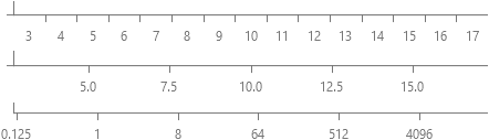
We’ve added new Blazor Charts API that allows you to customize point appearance. Handle the OnCustomizeSeriesPoint event and change how a point is drawn via the ChartSeriesPointCustomizationSettings object.
For example, you can customize a point’s visual settings (color, image, label’s text and visibility) as necessary:
<DxChart Data="@WeatherForecasts" OnCustomizeSeriesPoint="@PreparePointColor">
...</DxChart>
@code {
protected void PreparePointColor(ChartSeriesPointCustomizationSettings pointSettings)
{
double value = (double)pointSettings.Point.Value;
if (value > 75)
pointSettings.PointAppearance.Color = System.Drawing.Color.Red;
else if (value < 25)
pointSettings.PointAppearance.Color = System.Drawing.Color.Blue;
}
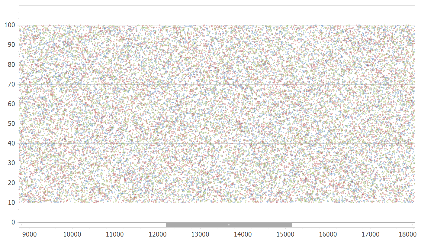
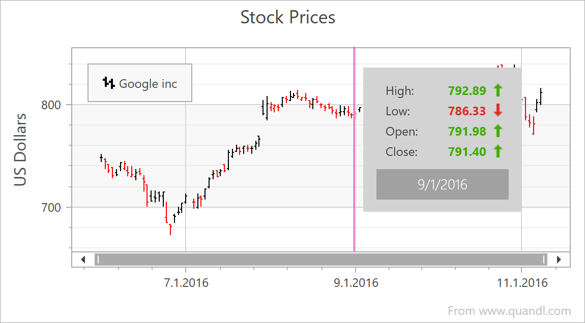
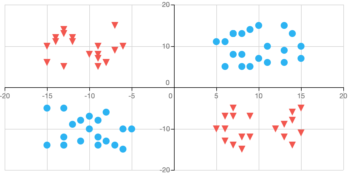
}The following image helps illustrate the power of this new Blazor Chart feature (Point Customization):
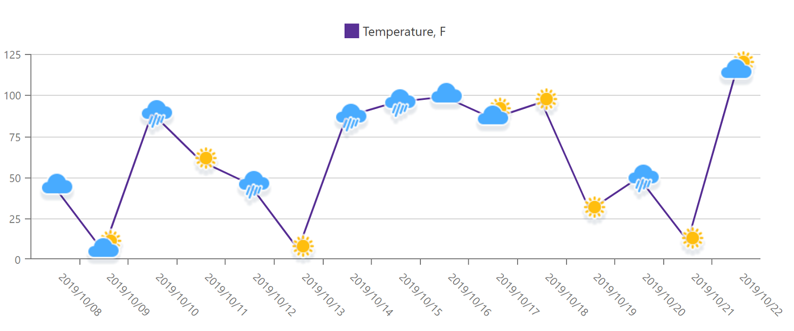
Chart point customization demos:
Tabs
With this update, DevExpress Blazor Tabs allow you to display an icon for any tab. To properly display an icon, set the CSS class of the icon to the TabIconCssClass property.
The code sample below illustrates how you can assign a custom CSS class to display an image on the first tab
<DxTabs><DxTabPage Text="Tab Page 1" TabIconCssClass=" custom-icon-css-class"><div>Tab Page 1 Content</div></DxTabPage><DxTabPage Text="Tab Page 2"><div>Tab Page 2 Content</div></DxTabPage></DxTabs>
Your Feedback Counts
As always, we welcome your feedback. Please share your thoughts below and tell us more about your Blazor-related development plans.