In this post, I’ll summarize some of the features we expect to deliver in our next major update (v20.2). If you are an active DevExpress Universal or DXperience subscriber, you can download and install our Early Access Preview (EAP) to explore the capabilities outlined herein. Once you’ve installed this EAP, please feel free to post your feedback here or on the DevExpress Support Center.
Note: Early Access and CTP builds are provided solely for early testing purposes and are not ready for production use. This build can be installed side by side with other major versions of DevExpress products. Please backup your project and important data before installing Early Access and CTP builds.
Perhaps most importantly, this EAP does not include all features/products we expect to ship in our v20.2 release cycle. We are working hard to finalize all v20.2 features/capabilities and once we have more information to share, we’ll post updates on this channel.
ASP.NET Core
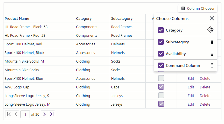
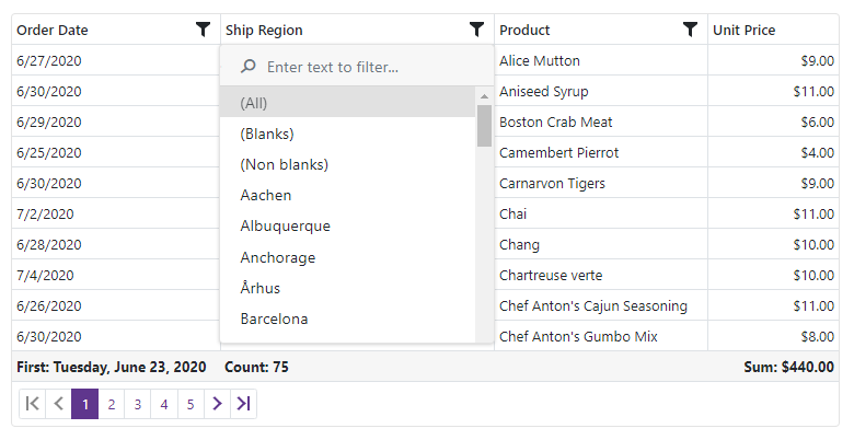
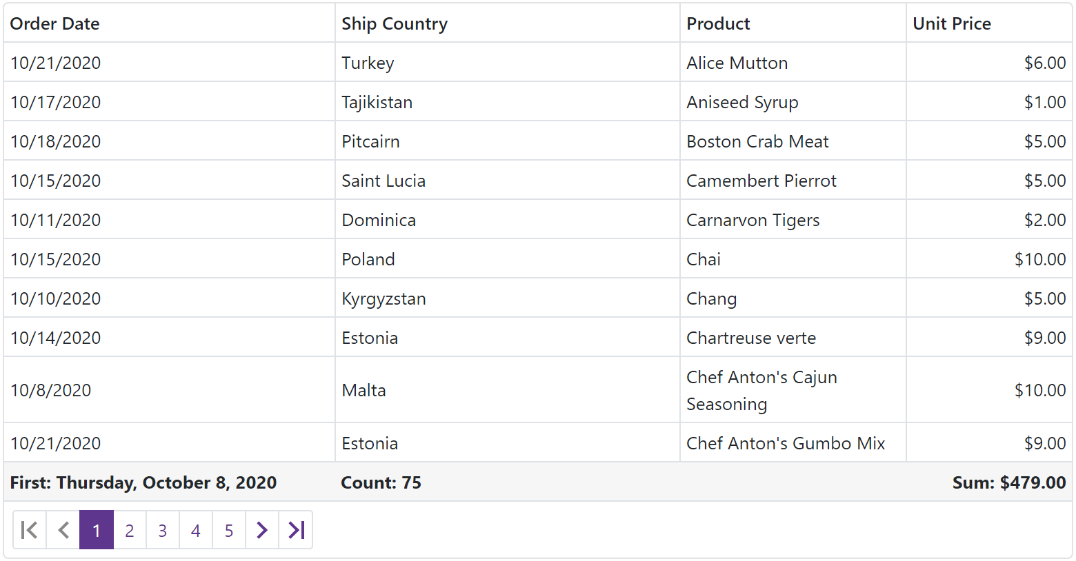
DataGrid and TreeList
Export to PDF
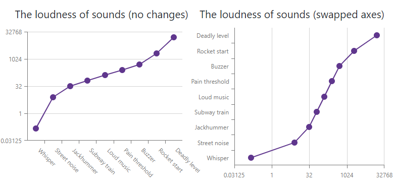
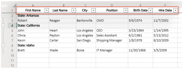
v20.2 will include the first version of our PDF Export engine. We researched multiple solutions and decided to build our new client-side PDF Export atop the jsPDF library.
The current version of our PDF Export engine allows end users to export the contents of the ASP.NET Core DataGrid to a PDF document while maintaining UI configurations (sort order, grouping, band layout, summary computation, etc.). Default PDF Export settings replicate the appearance of the DevExtreme Generic theme. If required, you can easily customize the appearance of individual cells or the PDF document itself.
Our PDF Export API allows you to:
- Customize cell content and appearance
- Add headers and footers
- Export custom PDF content
- Export multiple grids into a single document
![]()
To learn more and try our PDF Export demo app, please refer to the discussion page on GitHub.
Editing API Enhancements
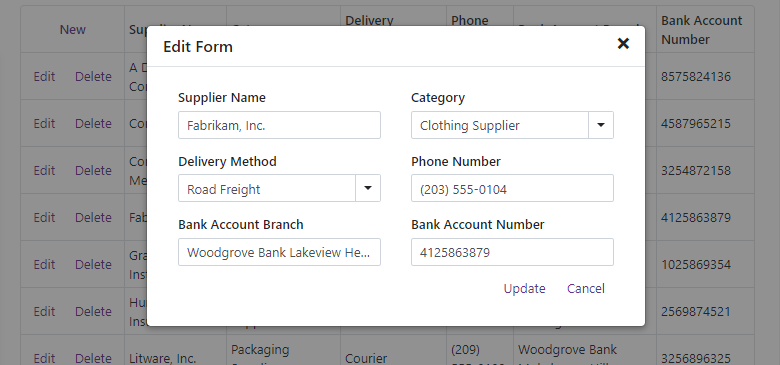
We have extended ASP.NET Core DataGrid and TreeList data editing APIs to better support declarative data bindings within React, Vue, and Angular applications. In addition, the following new capabilities will be available in v20.2:
- Get or set updated/inserted/deleted rows via declarative bindings
- Save all modified rows in a single request - batch edit mode
- Cancel changes made to an individual row - batch edit mode
- Get notified when editing is complete
Please note that these enhancements are not included in this EAP build. We’ve already published our API specification on GitHub and hope to preview the new API in an upcoming pre-release build. Please review our specification and let us know how we can improve our implementation to better serve your needs going forward.
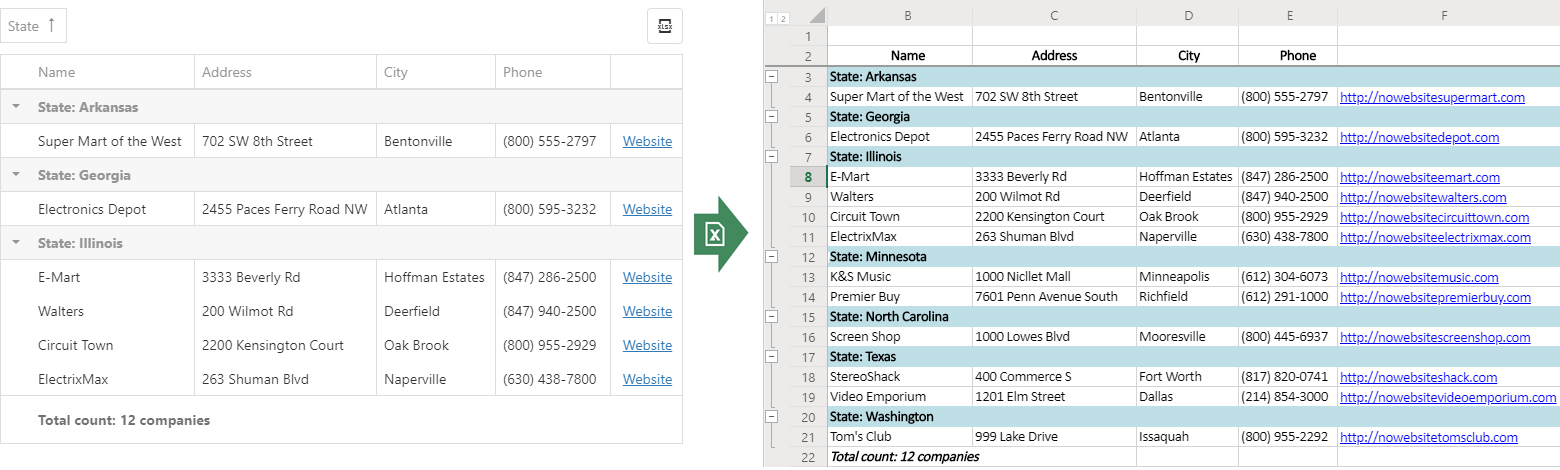
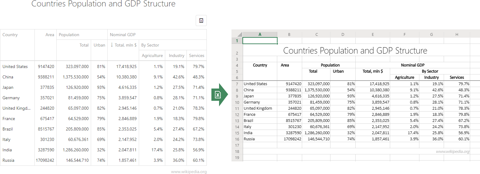
PivotGrid
New Export to Excel API
The ASP.NET Core Pivot Grid will ship with a new Export to Excel API. With this API you can:
- Customize cell data and appearance
- Export PivotGird Field Panel configuration data
- Add additional worksheets with custom data
- Display PivotGrid export progress/status
- Protect Excel cells and worksheets with passwords
![]()
Please refer to the corresponding discussion page to learn more and share your feedback.
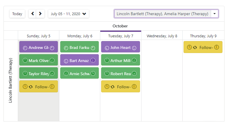
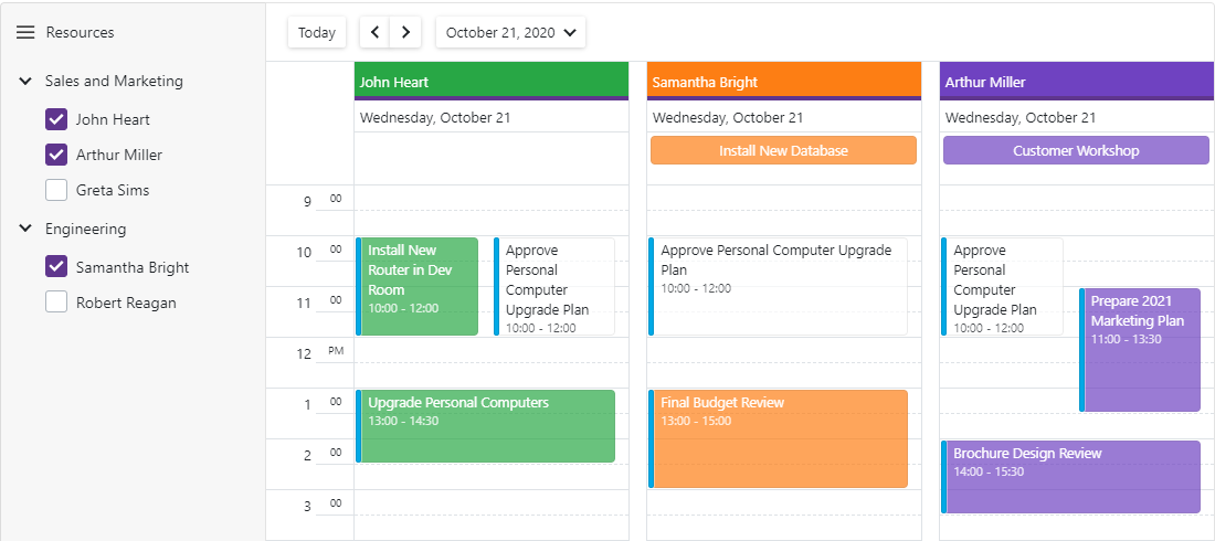
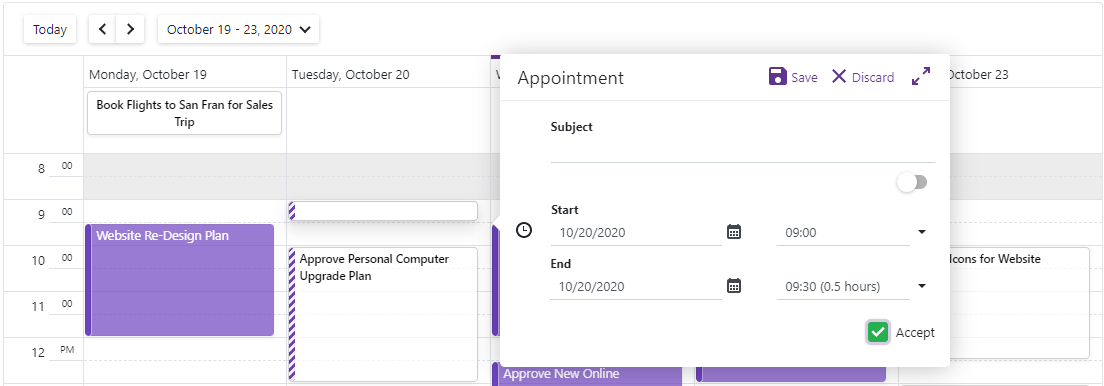
Scheduler
Virtual Scrolling
We’ve enhanced both the performance and usability of the Scheduler for ASP.NET Core. A new Virtual Scrolling mode is available when using the Scheduler’s Day view. If enabled, only visible Scheduler grid cells are rendered.
We are currently working to extend Virtual Scrolling mode to Week and Timeline views. We expect to ship this capability in our final v20.2 release.
Please subscribe to the discussion page for notifications related to Virtual Scrolling.
Recurrence Rule Support
We replaced our custom Recurrence Engine with the RRule open source library (currently used in more than 1800 projects worldwide). As a result, ASP.NET Core Scheduler now supports the iCalendar RFC 2445 specification.
Learn more on this discussion page.
Diagram
Partial Updates
Our Diagram for ASP.NET Core can now partially update its UI in response to external changes in its data source. As you might expect, data editing will no longer require a full reload on data change.
Data Binding Enhancements
Our new nodes.customDataExpr and edges.customDataExpr options allow you to link extra fields (from a data source) to Diagram elements. Linked data is replicated in the Diagram’s change history. As such, the Diagram control can undo/redo changes made to additional data fields. You can also use this new API to replicate custom element data when copying this element.
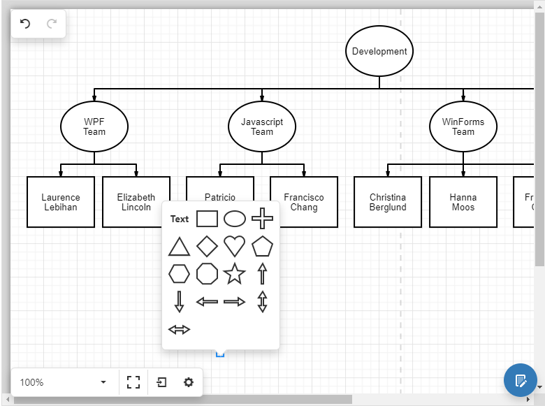
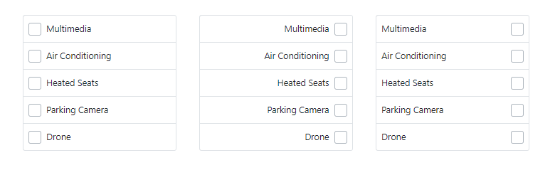
New Toolbox Configuration Options
We extended the ASP.NET Core Diagram’s Toolbox customization options. You can now specify toolbox width (toolbox.width), set the number of shapes displayed within a toolbox row (toolbox.shapeIconsPerRow), and hide the Toolbox search box (toolbox.showSearch). A new toolboxWidthToHeightRatio property allows you to modify the aspect ratio of toolbox shape items.
Toolbox Shape Templates
We introduced a new API for shape templates within the toolbox. Use the customShapeToolboxTemplate option to create a common template for all shapes and the toolboxTemplate option to set a template for an individual shape.
![]()
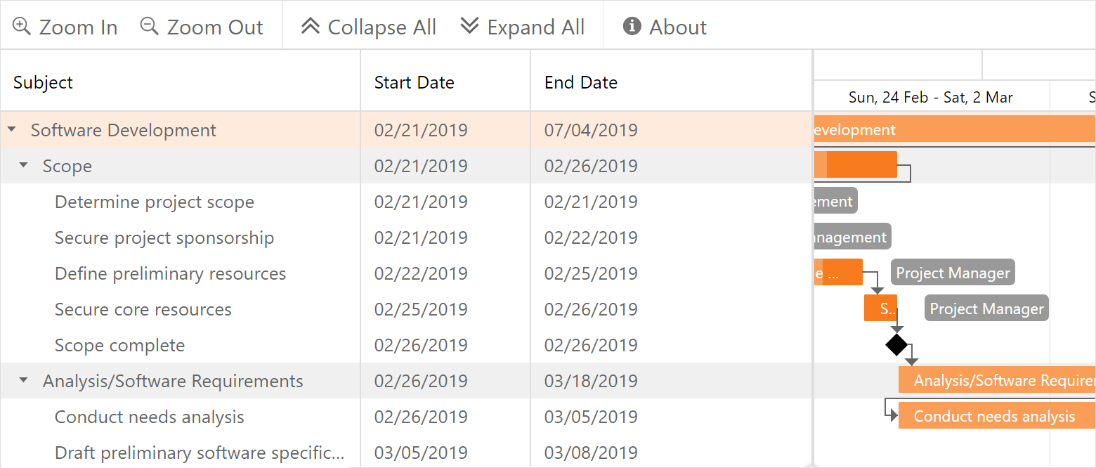
Gantt
Context Menu Customization
Our new contextMenu.enabled option allows you to disable/enable the Gantt context menu when appropriate. With the new contextMenu.items option, you can customize Gant context menu items (add, remove and reorder items, customize default item behavior, etc.).
To review the API usage examples and share you feedback, please refer to the following discussion page.
Editing API Enhancements
This release includes new client-side events designed to improve the editing process. Our Gantt for ASP.NET Core invokes these events after a task, a resource or a dependency is modified:
- startCellEditing and endCellEditing
- taskInserting , taskDeleting , taskMoving , taskEditDialogShowing , taskUpdating
- dependencyInserting and dependencyDeleting
- resourceInserting and resourceDeleting
- resourceAssigning and resourceUnassigning
Each event argument includes a cancel property (to cancel an action). For instance, you can prevent the display of the default dialog within the taskEditDialogShowing event handler or you can switch edit mode in the startCellEditing event handler. All these event arguments include values and newValues properties so you can access both original and modified object values.
Live examples are available on the corresponding discussion page.
Data Visualization
Annotations in Maps, Pie
We added Data Annotations to Vector Maps and Pie Charts for ASP.NET Core.
![]()
You can review supported use cases and our new API here:
Annotations in Pie Chart
Annotations in Vector Map (in progress)
Axis Label Customization
You can now use templates to render images (or any other custom content) within chart axis labels.
Please, refer to this discussion page to learn more about the new axis label customization API
RichEdit
Spell Checking
RichEdit for ASP.NET Core includes a special API to implement spell checking based on third-party tools. Use the options.spellCheck.enabled property to enable spell checking. The options.spellCheck.checkWordSpelling and
options.spellCheck.addWordToDictionary settings should be set to functions that control the word checking process.
Our Rich Text Editor package includes a webpack configuration file so you can build the NSpell bundle with required dictionaries.
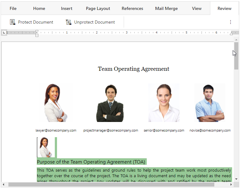
Document protection
Our Rich Text Editor for ASP.NET Core can now open/edit protected documents. These documents can include range permissions – wherein editing is restricted to specific sections (for a unique user or user group).
![]()
Use the editor’s
options.authentication
property to authorize the current document user by name or by user group name. Use the
options.rangePermissions
property to define how permitted ranges are highlighted.
Web Forms and MVC
Gantt
Context Menu Customization
This release includes a client-side PopupMenuShowing
event. This event allows you to manage the context menu as needed.
The event argument includes a menuItems property. The property returns a collection of items. You can modify this collection to add and remove items when appropriate. To add a custom item to the context menu, add an ASPxClientGanttPopupMenuItem object type to the menuItems collection.
var customItem = new ASPxClientGanttPopupMenuItem();
customItem.name = “ToggleResources”;
customItem.text = “Toggle Visibility of Resources ”;
customItem.beginGroup = true;
e.menuItems.Add(customItem);
When a user selects a custom item, our ASP.NET Gantt invokes a client-side CustomCommand event. The event argument’s commandName property returns the name of the clicked item.
function CustomCommand(s, e) {
    switch (e.commandName) {
        case “ToggleResources”:
            // operations
        break; ...
    }
}
To prevent the ASP.NET Gantt context menu from being displayed, set the event argument’s cancel property to true:
function PopupMenuShowing(s, e) {
e.cancel = true; }
New Client-side API
This release includes new client-side events designed to improve the editing process. Our WebForms and MVC Gantt control invokes these events after a task, a resource or a dependency is modified:
Each event argument includes the cancel property to cancel the action. For instance, you can prevent the display of the default dialog in the
TaskEditDialogShowing event handler or you can switch edit mode in the
StartCellEditing event handler. All these event arguments include values and newValues properties so you can access both original and modified object values.
See
API Documenation for details.
Diagram
New Toolbox Configuration Options
The number of shapes displayed within a Toolbox row now can be customized via the
SettingsToolbox.ShapeIconsPerRow
property. You can hide the search box via the
SettingsToolbox.ShowSearch
property.
<SettingsToolbox Width="500px" ShapeIconsPerRow="5" ShowSearch="False" />
The Diagram’s new
ToolboxWidthToHeightRatio
property allows you to modify the aspect ratio of toolbox shape items:
<CustomShapes><dx:DiagramCustomShape CategoryName="MyShapes" Type="square" Title="Square"
           BaseType="Rectangle" ToolboxWidthToHeightRatio ="1" DefaultHeight="1"
           DefaultWidth="1" /></CustomShapes>
Toolbox Shape Template
We introduced a new API for shape templates in the toolbox. Use the
CustomShapeCreateToolboxTemplate
event to create a common template for all shapes:
<ClientSideEvents CustomShapeCreateToolboxTemplate="CustomShapeCreateToolboxTemplate" />
function CustomShapeCreateToolboxTemplate(s, e) {
    var svgNS = "http://www.w3.org/2000/svg"
    var svgEl = document.createElementNS(svgNS, "svg");
    svgEl.setAttribute("class", "template");
    e.container.appendChild(svgEl);

    var textEl1 = document.createElementNS(svgNS, "text");
    textEl1.setAttribute("class", "template-name");
    textEl1.setAttribute("x", "50%");
    textEl1.setAttribute("y", "40%");
    textEl1.textContent = "New";

    var textEl2 = document.createElementNS(svgNS, "text");
    textEl2.setAttribute("class", "template-name");
    textEl2.setAttribute("x", "50%");
    textEl2.setAttribute("y", "70%");
    textEl2.textContent = "Employee";

    svgEl.appendChild(textEl1);
    svgEl.appendChild(textEl2);
}
The image below illustrates the resulting shape template.
![]()
Your Feedback Matters
We realize beta-testing is a time consuming process and we are grateful to those who invest time with our preview builds. Find the current implementation lacking flexibility? Feel we've overlooked a valuable usage scenario? Does our current implementation fail to address your business requirements? Please post your thoughts in the comment section below or create a Support Center ticket. We will happily follow-up and do what we can to extend the capabilities of our new products/features.
![]()
![]()